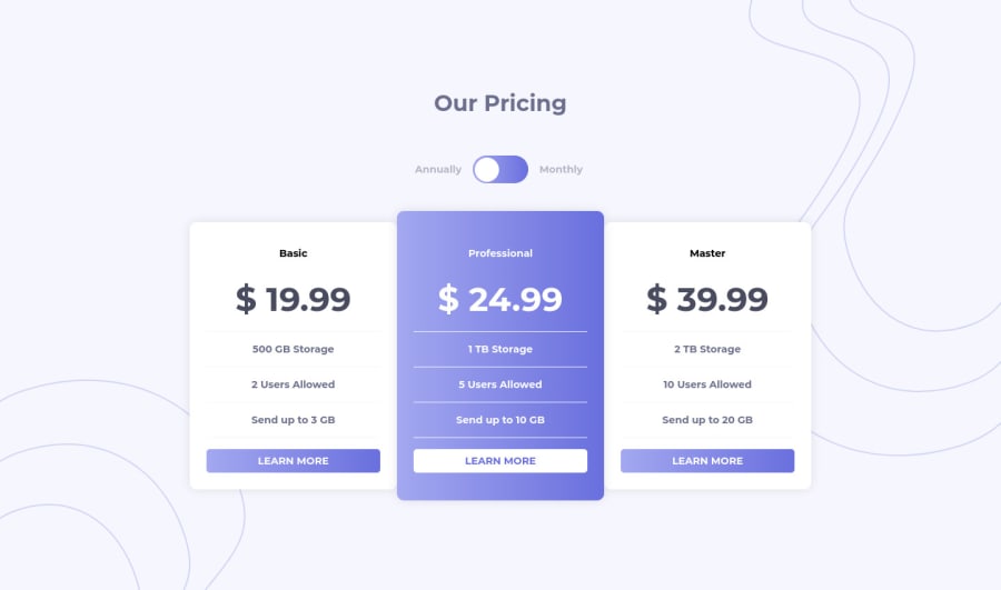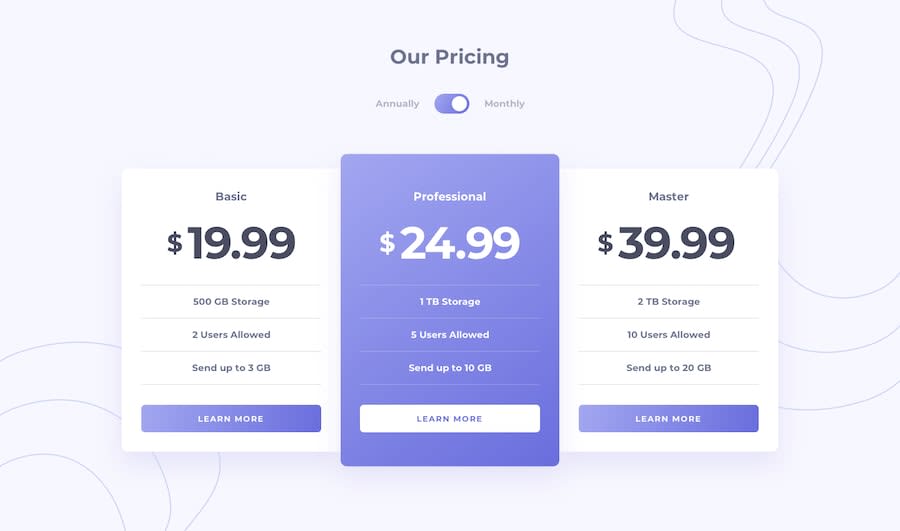
Design comparison
Solution retrospective
Hello! I have few questions regarding accessibility:
-
It seems like the screen reader (Windows Narrator) skips my toggle component on the first run and only read it when I selects it. It also skips the aria-label on my <ul> tags and only read them when the aria-live is triggered (when monthly pricing plan is shown)
-
What's the best way to suggest an item in accessibility? For e.g. suggesting the middle pricing plan (which is probably why it's colored differently)
Please help me out with the issues. Feedbacks will be greatly appreciated~ :)
Community feedback
- P@palgrammingPosted almost 4 years ago
Looks really good but you are missing your hover state on your card buttons
2@A-amonPosted almost 4 years ago@palgramming Thank you! I totally missed it~ It's fixed now
0P@palgrammingPosted almost 4 years ago@A-amon great one more thing you should make your desktop transition later cause if you look at your challenge in a browser at 880px wide you will see your cards wrapping with 2 on top and on in the bottom
0@A-amonPosted almost 4 years ago@palgramming I left it there cause I thought it's still large enough to not be vertically arranged but I guess not! :p I have fixed it~
0P@palgrammingPosted almost 4 years ago@A-amon sorry one more thing look at the top margin on "Our Pricing" when the browser is 778px and 768px wide
0P@palgrammingPosted almost 4 years ago@A-amon No problem and at least you are putting projects up
1 - @grace-snowPosted over 3 years ago
Hi
Well done on the effort with this in making it accessible. It's great to see you're thinking about this stuff
However, I've just tried it with my screenreader and can't understand at all what's happening. It's reading out everything in basic on first check, then not telling me which price is active when I go to the checkbox again. It's really confusing.
Additionally, as there are no focus styles, I cannot navigate with keyboard.
Deep down I expect this component can only be made fully accessible with a little javascript.... although you've definitely challenged my thinking there. It might be possible and I don't think you're too far off. But the aria live announcement would have to change and this would need to use radio inputs not a checkbox I think. On check of one of the radios, the aria could just say "prices updated to monthly below" but you'd need to have two messages ready in the dom and show/hide with display none. I think that might be ok, but would still need thorough testing
0
Please log in to post a comment
Log in with GitHubJoin our Discord community
Join thousands of Frontend Mentor community members taking the challenges, sharing resources, helping each other, and chatting about all things front-end!
Join our Discord
