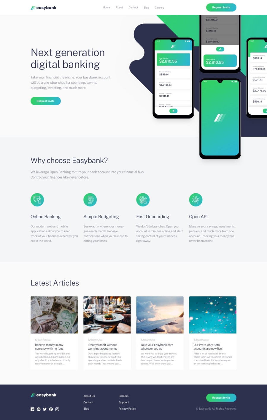
Design comparison
Solution retrospective
Hello. What do you think about my solution of this project? Maybe you have a some advices to improve this solution? Thank you for a note.
Community feedback
- @brasspetalsPosted over 3 years ago
Hi, Karol-Czyzewski 👋
Congrats on completing another challenge! Your solution responds nicely, although you might want to include some max-widths to the layout as it gets a bit stretched out on large screens (i.e. 1920px).
To clear up those accessibility and html errors:
- add an
aria-labelto your button - add
altattributes to your images, even if you just leave them blank (ex:alt=“”) - for your footer social links, you could add
titletags to your svgs, although I believe adding anaria-labelto the anchor tags wrapping the svgs also works.
The navigation links on desktop don’t match the design. I highly suggest trying to create the gradient underline effect. Using a
::beforeor::afterpseudo-element is really handy for this.Speaking of the navigation, I noticed you have two separate navigations for desktop and mobile (I did this in one of my solutions once too 😅). This isn’t best practice. Instead you could use a media query to change the styling between desktop and mobile. Sometimes this can be a bit tricky, but it’s worth the effort!
For your next project, I really encourage you to try a mobile-first approach. I find it much easier than doing desktop first. It's a bit of an adjustment at first, but again, well worth it. 😄
Hope this helps and happy coding!
2@Karol-CzyzewskiPosted over 3 years agoHi, 👋 brasspetals Thank you for your feedback and advices. I will try to improve HTML, navigation and @media.
Greetings! :)
1 - add an
Please log in to post a comment
Log in with GitHubJoin our Discord community
Join thousands of Frontend Mentor community members taking the challenges, sharing resources, helping each other, and chatting about all things front-end!
Join our Discord
