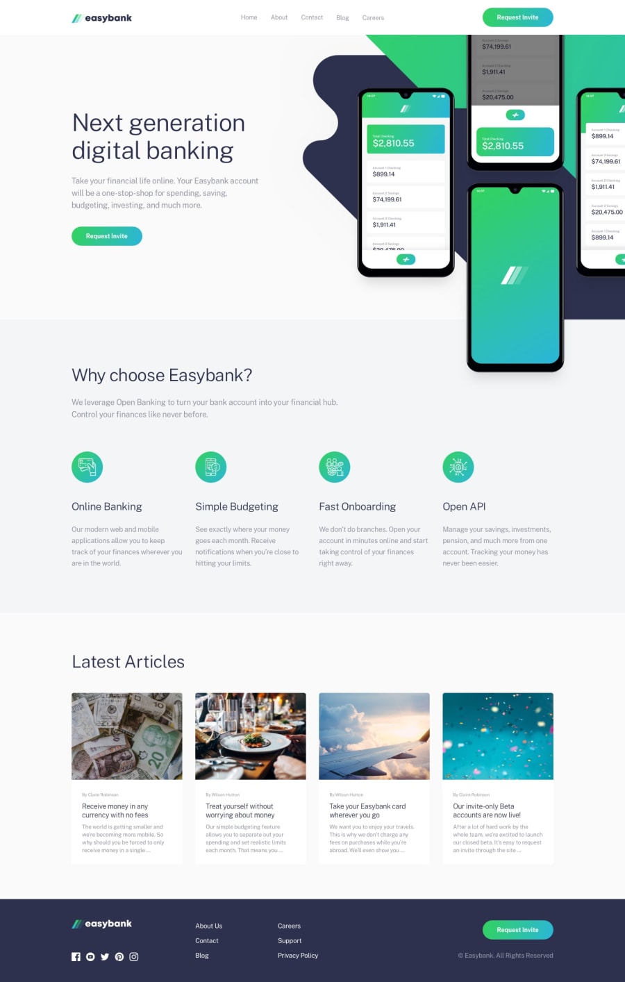
Design comparison
SolutionDesign
Community feedback
- @ApplePieGiraffePosted over 3 years ago
Hi there, Maria Glynou! 👋
Nice job on this challenge! 👏 I like the different favicon that you added to your page! 👍
I suggest,
- Turning the navigation links in the footer of the page into actual links using the anchor tag.
- I believe the article cards are supposed to be links, too, so it would be if you wrapped them in an anchor tag, as well.
- Changing some things about the desktop layout a little sooner than 1024px so that certain parts of the page don't look too squeezed right before the layout changes and to prevent a horizontal scroll bar from appearing along the bottom of the page.
- Using a
<button>instead of an anchor tag for the mobile menu toggle button (since it is really more like a button, not a link).
Hope those tips help. 🙂
Keep coding (and happy coding, too)! 😁
1@MsglPosted over 3 years ago@ApplePieGiraffe Thank you so much for the feedback 😁 It really helped me a lot! I updated the solution, there are still some things that bug me in my solution but I think I'm getting there 😅
1@ApplePieGiraffePosted over 3 years ago@Msgl
Glad to help, Maria! 😀
I just took another look at your updated solution, and the changes look good! Keep it up! 👍
0
Please log in to post a comment
Log in with GitHubJoin our Discord community
Join thousands of Frontend Mentor community members taking the challenges, sharing resources, helping each other, and chatting about all things front-end!
Join our Discord
