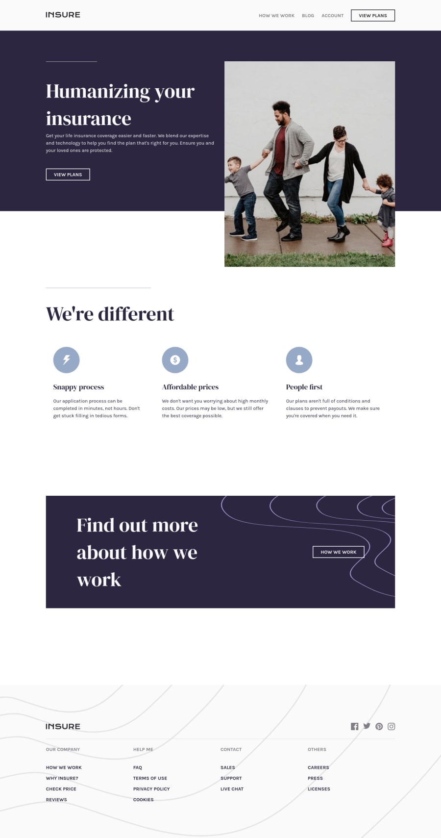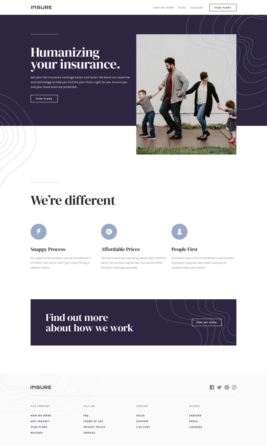
Design comparison
Solution retrospective
Its my second try at mobile-first. My thoughts on mobile-first method is that it feels like it makes the coding a lil less complicated (I might be wrong tho!)
Anyway, any feedback and suggestion is welcomed!
Community feedback
- @brasspetalsPosted almost 4 years ago
Hi, Amon! Congrats on completing this challenge! 🎉 I definitely think mobile-first makes coding easier, and typically also makes the transitions between layouts looks smoother. 👍
Overall, good job on this one! You followed the design nicely, and I noticed you made some nice changes and tweaks since your initial screenshot. I know that hero image was tricky!
I do have a few suggestions:
- Your nav__button text gets lost when hovered on desktop. Although unlikely to happen on mobile due to touchscreens, the hover states for all your mobile nav links also get lost on hover as they’re the same purple as the background.
- You may also want to consider adding some max-widths to your paragraph tags. The ones on both the hero and the differences section get stretched out before hitting your tablet styles, as well as on large screens (1920px).
- Speaking of large screens, you might want to take a look at the hero section in particular and see if you can make some adjustments to stop the image from overflowing and covering up some of the “differences” section text.
Marked as helpful1@A-amonPosted almost 4 years ago@brasspetals Thank you! I fixed them~ Yes, the hero image was tricky, but somehow doing it mobile-first after trying out desktop-first makes the adjustment easier (Not sure how its related but it does somehow!) I added max-height to the hero image and it works, but at the expense of the cropped out ground~
0@brasspetalsPosted almost 4 years ago@A-amon About mobile-first, I think it's just easier to "expand" than "contract" when it comes to layouts, so doing it that way makes it feel easier? Just my theory! 😄
To help with the stretching, you could also add container/wrapper divs around the content inside each section, and give those a max-width and center them. That way the background colors and styles set on the sections will still stretch the full width of the page, but the content will only stretch so far but stay centered. I hope that makes sense! 😅
0@A-amonPosted almost 4 years ago@brasspetals Yes, it does! It's kind of like adding padding. I will try it out one day :)
0
Please log in to post a comment
Log in with GitHubJoin our Discord community
Join thousands of Frontend Mentor community members taking the challenges, sharing resources, helping each other, and chatting about all things front-end!
Join our Discord
