Design comparison
Solution retrospective
Any feedback is welcomed!
Community feedback
- P@palgrammingPosted almost 4 years ago
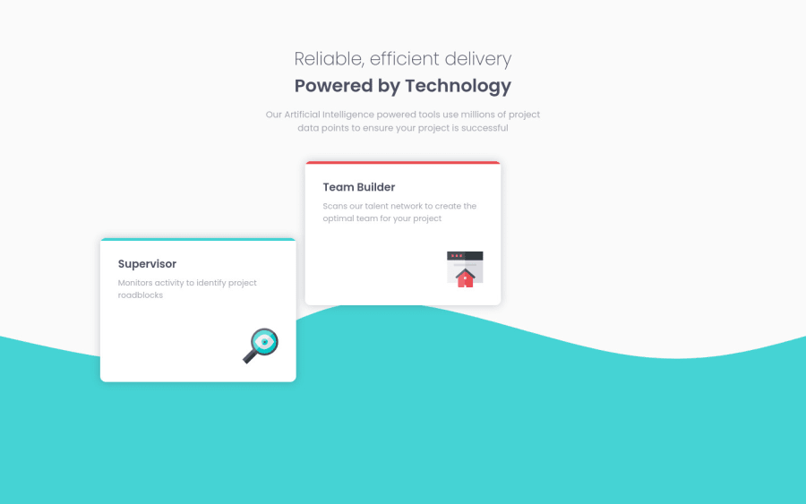
Wow at first I did not know what I was looking at with the wavy background but after a couple moments of hovering the cards and looking at it I am really impressed ⭐⭐⭐⭐⭐ I think the wavy background might be a little too much but I like how you made the color switch on it when you hovered the card. I think if you removed the wavy background but made the "Powered by Technology" text change to the color of the hovered card then the animation of the card would be more of a centerpiece of the project and tie everything together really nice
1@A-amonPosted almost 4 years ago@palgramming I didn't think of that! Yea, that does sound a lot better~ Thank you!
1P@palgrammingPosted almost 4 years ago@A-amon Looks really good glad you liked the suggestion the only part I also noticed was the card animation is not also in the mobile view
0@A-amonPosted almost 4 years ago@palgramming I had my doubt about putting lots of animation in mobile view! I'm guessing users would rather scroll down instantly rather than waiting for animations to end. It's just my thoughts tho! What do you think?
0 - @volod-onePosted almost 4 years ago
I like your fancy code. Simple and effective.
0@volod-onePosted almost 4 years ago@A-amon btw, when you hover mouse on the bottom of each card, it begin shaking much, so I think it can be fixed by adding container for every card and make container a bit bigger. Then add hover effect for this container. I guess you know what I mean
1@A-amonPosted almost 4 years ago@DevilDoctor27 And it has to be unaffected by the animation's movements too, I guess! I will look into it~ Thank you!
0
Please log in to post a comment
Log in with GitHubJoin our Discord community
Join thousands of Frontend Mentor community members taking the challenges, sharing resources, helping each other, and chatting about all things front-end!
Join our Discord
