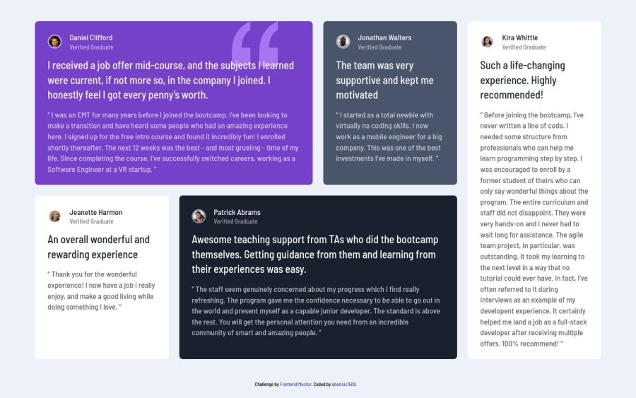
Design comparison
SolutionDesign
Solution retrospective
Feedbacks are much appreciated.
Happy coding :)
Community feedback
- @Kamasah-DicksonPosted over 2 years ago
Your solution looks so good and responsive in small devices. Text are readable and I like your spacing among cards. To help with the accessibility issues.
- Always use your h tags in decreasing order don't mix them up like that.
- wrap your solution in a <main> semantic tag or change the div of the parent container to main. Besides good job there👍 Happy coding👍💻
Marked as helpful0
Please log in to post a comment
Log in with GitHubJoin our Discord community
Join thousands of Frontend Mentor community members taking the challenges, sharing resources, helping each other, and chatting about all things front-end!
Join our Discord
