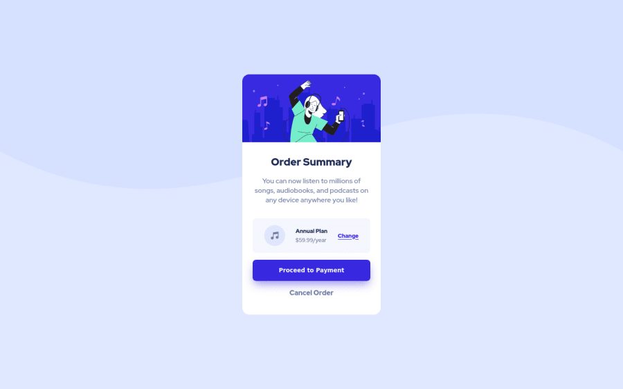
Design comparison
SolutionDesign
Solution retrospective
Drops some tips..
Community feedback
- @techantherePosted almost 3 years ago
The solution looks great and responsive as well. I am adding few tips here:
- Use an anchor tag where you see a hover state, like in your solution instead of button use an anchor tag and style it the same way to look like a button, makes it semantically sound.
- Nested CSS is not good for specifying a class instead you can simply mention class name alone that will make code more efficient with less specificity, for example use .card-context alone instead of writing it with parent class, it is sufficient. I can't see hover states behavior as specified by design files, you should add them too. Everything else is fine. Hope it's helpful. Good luck :)
0
Please log in to post a comment
Log in with GitHubJoin our Discord community
Join thousands of Frontend Mentor community members taking the challenges, sharing resources, helping each other, and chatting about all things front-end!
Join our Discord
