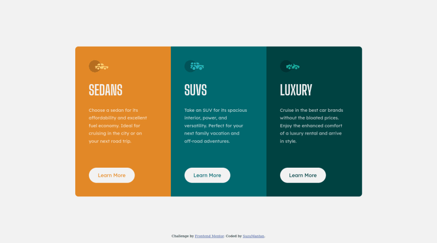
Design comparison
Solution retrospective
Hello 👋
I should say desktop and mobile size looks good to me. Any advice and feedback are always appreciated. Thanks 👏
*Also on the side note, I set a time limit to finish this on 3 hours, so maybe its not perfect but its a good practice for me to focus * 😅
Community feedback
- P@palgrammingPosted almost 4 years ago
Some elements needs fixed widths so they should not be allowed to shrink when the page transitions to mobile
0@agusthasPosted almost 4 years ago@palgramming i see, thank you for your advice. I will soon refactor this 🙏
0 - @Muhammad-samirPosted almost 4 years ago
Every thing looks perfect but I see you should use (transition) on buttons to be more smother
0@agusthasPosted almost 4 years ago@Muhammad-samir yeah, should have put a smoother transition 😅. Thank you for the advice 🙏
0
Please log in to post a comment
Log in with GitHubJoin our Discord community
Join thousands of Frontend Mentor community members taking the challenges, sharing resources, helping each other, and chatting about all things front-end!
Join our Discord
