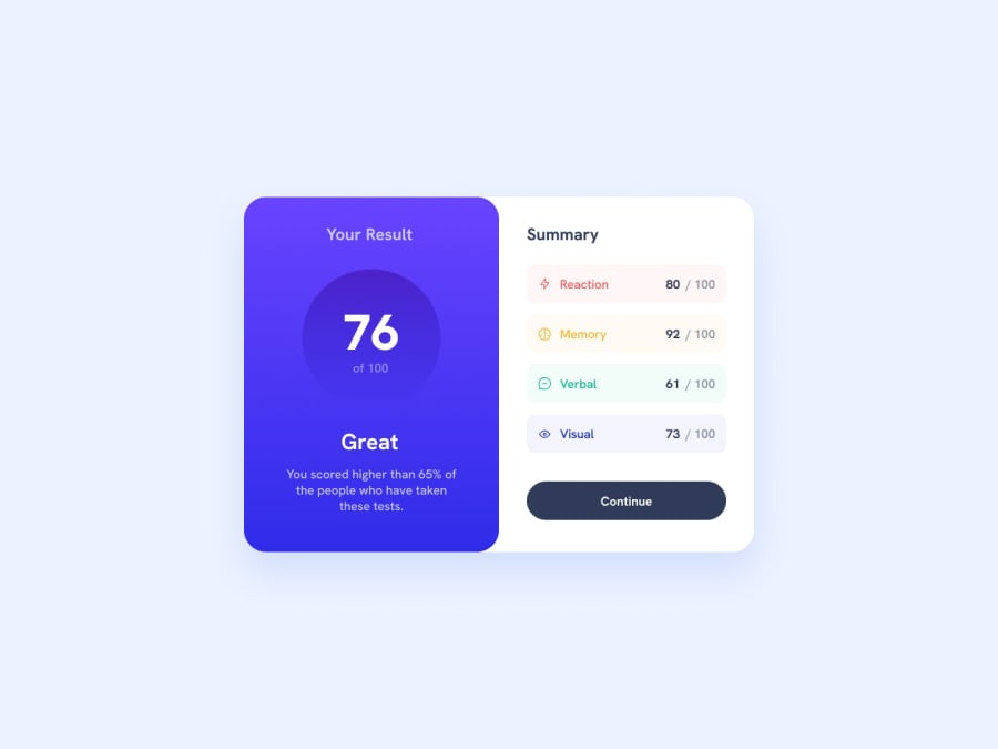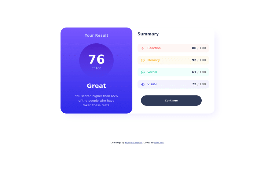
Design comparison
Solution retrospective
- How can I improve my CSS responsability ?
- Did I use SCSS' full potential ?
- Could my CSS be simpler ?
Community feedback
- @waffleflopperPosted over 1 year ago
I'm not quite versed enough in SASS yet to let you know if you're harnessing it's full potential yet. That being said there are a few things I can see, in general, but you may have had a purpose behind it.
CanIUse is a great site for checking what CSS properties are supported in what browsers. The reason I bring this up is I noticed you were doing background styles using -webkit and -o notations, when linear-gradient() on it's own has been widely supported for some time. So unless you are supporting some really old computers or that very (very) small percentage of people using browsers that don't fully support linear-gradient(), it's just redundant syntax.
While I'm just learning SASS myself, I'm trying to use mixins where possible in areas that can be served by them. For example in my own solution to this project I used my own mixin for bg-gradient because I knew I was going to be using it in a few spots and @include bg-gradient($slate, $royal) was just nicer to put in (for me at least). They're also really popular to use in media breakpoints.
While using %s and or viewport units can be really nice and make things feel really responsive, they can create a lot of issues on their own - especially when setting the browser to weird dimensions. Your design breaks in a few different ways when I manipulate the dimensions. Additionally on mobile vh/vw doesn't account for the address bar that mobile browsers take up and can break designs reliant on them as well. You can use DVH or DVW if you're really set on using viewport units, but I would stick with either pixels, em or rem, and set some max-widths and max-heights to constrain your design to keep it from breaking when shrinking things down, or expanding them out to the extremes.
Lastly, I would look at trimming back some divs. For example, putting the continue button in a container isn't really necessary as it's a single contained button that can be positioned inside a flex box on it's own.
I do like how you separated concerns with your SCSS files. I had all of my stuff in a single file but I can definitely see the advantage of having things in their own areas - especially when working with larger projects.
Keep on trucking!
Marked as helpful0@nina-alinPosted over 1 year ago@waffleflopper Hi! Thank you for your feedback! It's awesome to see such a detailed comment on my work! :)
I have some questions about what you pointed out here:
- I've seen a lot of people telling to not use fixed size units, especially pixels, and instead use (d)vh/(d)vw. Obviously, I think it depends on the context, but in which cases it is appropriate to use pixels? On borders? On margin/padding?
- I always put my buttons into div because some properties doesn't work quite well when I put them on the button itself. Maybe I missed something, but especially on text properties, I always put them on the div and not on the button.
Thank you again for your feedback :)
0@waffleflopperPosted over 1 year ago@nina-alin I'm just getting back into it so if you're hearing from more people to use view units, percentages or em/rems - I'm sure there's a reason. I may very well (and likely am) wrong in that regard. I've just always used fixed size for things because of the precise control and I guess old habits die hard. My next project I'm going to make an effort to utilize them only where appropriate (like border widths, or non-content divs (like the little circles in the expense chart challenge).
I think mostly we're suppose to use the semantic markup because there's built in stuff for interacting with the accessibility options that some people use. If you don't want to fight with the styling of them (and I get it - things like selection boxes or toggles are a nightmare) you can use
all: unset
to unset all the styles for that element, then add on what you need.0
Please log in to post a comment
Log in with GitHubJoin our Discord community
Join thousands of Frontend Mentor community members taking the challenges, sharing resources, helping each other, and chatting about all things front-end!
Join our Discord