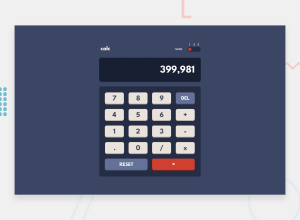
HTML, SASS, Vanilla JavaScript, desktop to mobile.
Design comparison
Solution retrospective
I'm not a pro about CSS and still learnign SASS, I would like to hear a feedback about the change of themes and kinda of tecniques about variables. Thank you.
Community feedback
- @palgrammingPosted over 3 years ago
well the first thing you might want to work on non css related it that one can enter multiple periods in on number entry
also non CSS would be adding keyboard inputs
CSS related I at least thing the buttons need a thin black outline around them or some kind of hover state for the user to know they are on one
0@Alias-AlanPosted over 3 years ago@angelp495 I agree with @palgramming and think a little fine-tuning graphic-wise would improve this 10 fold. Perhaps a black outline for each button itself, maybe an illumination for on-hover buttons, and then a background color changed for on-click buttons.
1@angelpineda-devPosted over 3 years ago@Alias-Alan indeed, I can see your point, I need to give the user more UI signals or info about the actions in the app.
0
Please log in to post a comment
Log in with GitHubJoin our Discord community
Join thousands of Frontend Mentor community members taking the challenges, sharing resources, helping each other, and chatting about all things front-end!
Join our Discord
