Design comparison
SolutionDesign
Solution retrospective
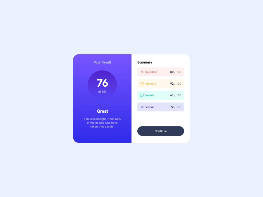
Exact Design match and Responsive,
Community feedback
- @JeuriMorelPosted about 1 year ago
On my screen the
height: 45vh;on themainis making the card appear too short and has thebuttonoverlapping the Visual scorecard. Having the height work the way you have it means that content is lost when screen height isn't big enough.1 - @finitehorizonsPosted about 1 year ago
You're missing the border-radius on the left Results component's right side as well as the box shadow(hint: you're using the color elsewhere)
0
Please log in to post a comment
Log in with GitHubJoin our Discord community
Join thousands of Frontend Mentor community members taking the challenges, sharing resources, helping each other, and chatting about all things front-end!
Join our Discord
