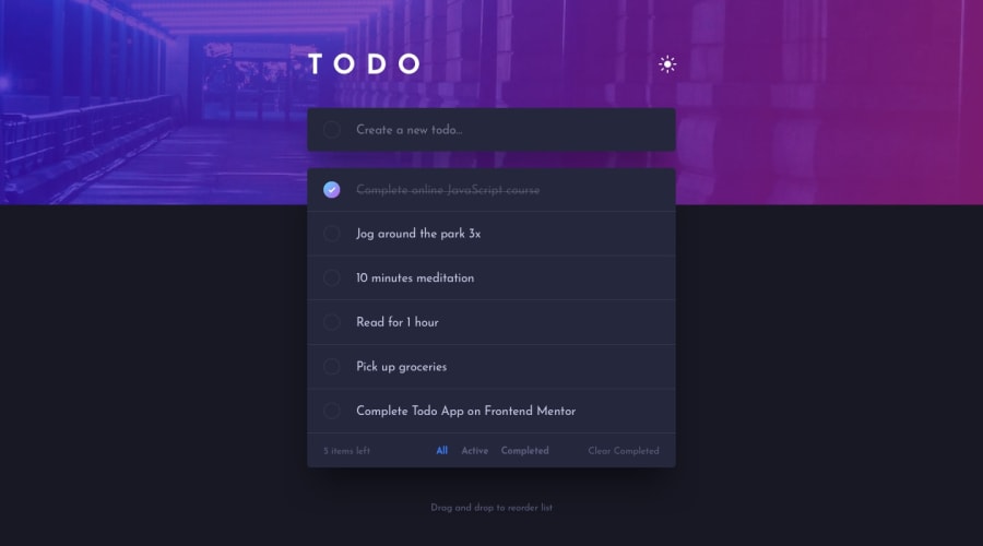
Design comparison
SolutionDesign
Solution retrospective
It was my hardest challenge soo far , it has a lot tricky stuff , but it is somehow finished , Hope you like it , ill appreciate any feedback. Happy coding to you all :)
Community feedback
- @ApplePieGiraffePosted over 3 years ago
Hi, Shomy032! 👋
Nice job on this challenge! 👏 The to-do list functions quite well and so do the light/dark themes! 🙌
I'd like to suggest,
- Allowing users to mark items as completed by clicking on the name of the item (rather than just the checkbox to the left of it).
- Perhaps adding a little border-radius to the input element and the to-do list (as in the original design).
- Using the font provided in the original design to improve the overall look of the text in your solution a bit.
Keep coding (and happy coding, too)! 😁
2
Please log in to post a comment
Log in with GitHubJoin our Discord community
Join thousands of Frontend Mentor community members taking the challenges, sharing resources, helping each other, and chatting about all things front-end!
Join our Discord
