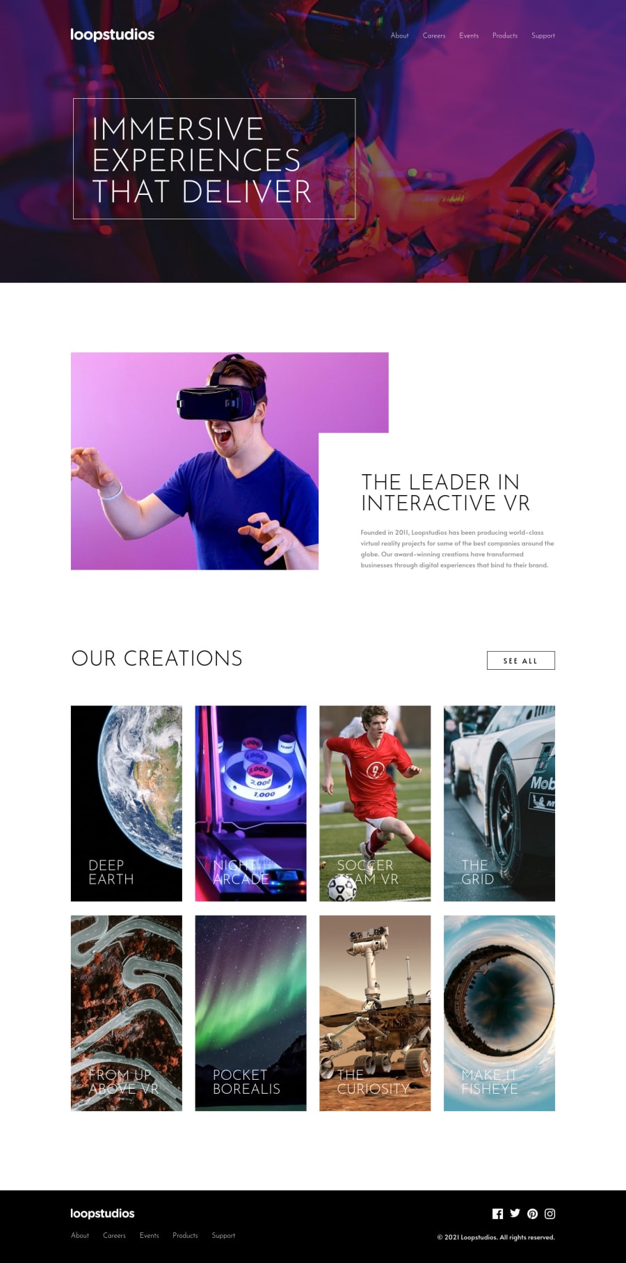
Design comparison
Solution retrospective
Used this as a Timebox project to see if I can stick to the planned 1-hour time cap. was fun. any feedback always welcome
Community feedback
- @DesignAssemblyPosted over 3 years ago
Hi @tediko, thank you for the feedback much appreciated. Yeah, my focus was definitely not on accessibility but more on layout and time boxing. if we really want to go down that rabbit hole then the first thing you need to add is a "skip to content" button (which is added in). there is way more to accessibility than a couple of tab functions. this page scored a 97 on the accessibility chart so I'm good with that. Added in the outline so all is good. thanks again and happy coding to you too.
0 - @tedikoPosted over 3 years ago
Hello, Gavin! 👋
Good job on this challenge! Your solution responds well and looks nice. Some tips from me:
- Since your
.logo
image is decorative youralt
text should be provided empty (alt="") so that they can be ignored by assistive technologies, such as screen readers. - Add
:focus
pseudo class to interactive elements like anchors, buttons etc. Useoutline
property to make your website more accessible to keyboard users. Focusable elements like anchor, buttons or inputs they have applied default:focus
pseudo class withoutline
property. These default styles are subtle and hardly visible tho. Furthermore every browser has a slightly different default style for the outline, so you probably want to change the default style. Read more about why we should change focus styles.
Good luck with that, have fun coding! 💪
0 - Since your
Please log in to post a comment
Log in with GitHubJoin our Discord community
Join thousands of Frontend Mentor community members taking the challenges, sharing resources, helping each other, and chatting about all things front-end!
Join our Discord