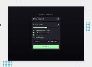
Design comparison
SolutionDesign
Solution retrospective
What are you most proud of, and what would you do differently next time?
writing js mostly by myself without any help
What challenges did you encounter, and how did you overcome them?sizing elements on smaller devices
Community feedback
- @marcfrancissPosted 4 months ago
Impressive solution to this challenge! 💯
I just notice that the password container and the 'Generate' button is overflowing on small-sized screen (375px). Upon checking your css, all I can suggest are to add 'box-sizing: border-box', replace 'max-width' with 'width: 100%' and lastly resizing paddings.
* {
 box-sizing: border-box;
/ ... other css /
}

.password-wrap label input {
    width: 100%;
    padding: 16px 16px;    Note: 'auto' is invalid when using shorthands like 'padding:'
 / ... other css /
}

.settings button {
        width: 100%;
        padding: 16px 16px;
 / ... other css /
    }
Hope this helps you somehow. Cheers!
0
Please log in to post a comment
Log in with GitHubJoin our Discord community
Join thousands of Frontend Mentor community members taking the challenges, sharing resources, helping each other, and chatting about all things front-end!
Join our Discord
