Submitted almost 4 years ago
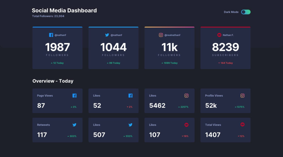
HTML / Sass / JS – BEM / Implemented Josh Comeau's "Perfect dark mode"
@Pustur
Design comparison
SolutionDesign
Community feedback
- @grace-snowPosted almost 4 years ago
Hi Pustur,
The theme switcher is awesome, love it!
My screenreader does have issues with how it's reading the content, however. I think this is because you are wrapping the whole contents of the card in an anchor tag. When you do that, a screenreader ignores all other semantics inside the card and reads everything in one string. It sounds really odd when that happens.
A better markup would be something like this:
<li class="card card--current card--facebook">
    <h3 class="sr-only">Facebook</h3>
    <a href="" aria-label="Follow @nathanf on Facebook" class="card__title">
        <img src="./images/icon-facebook.svg" alt=""> @nathanf
    </a>
    <p>
        <span class="card__number">1987</span>
        <span class="card__type">Followers</span>
    </p>
    <p class="trend trend--positive">
        <span class="trend__arrow">+</span> 12 Today
    </p>
</li>
If you then wanted to make the whole card into a clickable link, in CSS you would:
- make the li
position: relative - add a pseudo element to the anchor tag that fills the whole card space, something like:
content: ''; position: absolute; top: 0; left: 0; height: 100%; width: 100%; cursor: pointer; z-index: -1; - add a focus state to the link. On focus make the pseudo gain an offset outline or something instead of the link itself.
I hope that's helpful! REALLY nice work on this 👍
1 - make the li
Please log in to post a comment
Log in with GitHubJoin our Discord community
Join thousands of Frontend Mentor community members taking the challenges, sharing resources, helping each other, and chatting about all things front-end!
Join our Discord
