HTML Sass JavaScript Sortable.js Local Storage
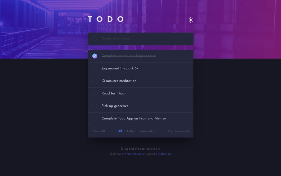
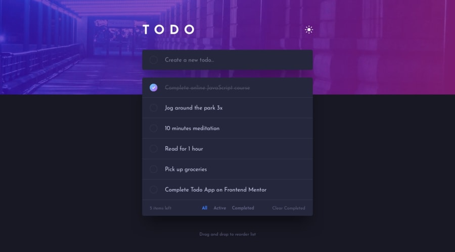
Design comparison
Solution retrospective
Hello folks 😀
This past ten days with this challenge was the best..!. I learnt a loooot of stuffs, either by making a mistake or by the requirements. I tried to make this as good as possible within a week or two because you never get satisfied by the design and details...
Even now while submitting the solution, I am thinking of adding some more things like when the user redirect, there will be an animation of fade-in only when the theme is dark but I controlled myself because I wish to touch some other challenges too🤣
There is this feature called maybe PWA that I really wanted to do which lets the user to add the web app to mobile home screen but it was quite hard for me for now 😅
Questions
- How to reduce the delay while using the fluid typography(as you may have noticed)?
- How to smoothly displace elements while sorting?
- How can I make my JavaScript code cleaner?
Any other feedback is humbly welcome..! 😘
Community feedback
- @ApplePieGiraffePosted almost 4 years ago
Greetings, Roc Tanweer! 👋
I know I'm very late to this challenge! 😅 I just saw your comment requesting for feedback on my solution for this challenge today (I think you might have accidentally mentioned your username in the comment instead of mine, which is why I didn't get notified)! 🙃 But anyways, now that I've seen your solution, I can say I think you've done a wonderful job on this challenge! 😀
The little animations that you added around your solution are very nice and the to-do list itself looks good and works well! 👍 Great attention to detail! 🙌
The only very small suggestion I have is to give your document a title using the
<title>tag. 😉And also, don't forget to take a look at your solution report and try to clear up some of the errors that are there. There seem to be a few duplicate IDs (that should be easy to remove) and for the rest of the errors, don't forget to prefix any custom attributes that you add to HTML elements with
data-(if that's the reason for thecompletedattributes on some<div>s).As for the "delay" between when the page is resized and the fluid typography adjusts in font-size, you might want to remove the
transitionon the text on the page (since that isn't necessary) so that they respond to changes in the size of the viewport faster. 🙂Hope that helps. 😊
And as always—keep coding (and happy coding, too)! 😁
1@RocTanweerPosted almost 4 years ago@ApplePieGiraffe he he he he
I forgot to change the title name..!
Yeah about those issues, I didn't know about data attributes when I was building this that's why I used
completedand duplicatedids(I will fix that when I will get the time 😅)This project was quite big for me so I forgot to see some of the things(That's why we need feedback)
Thank you for your feedBack and I will fix all of them ASAP..!
Yeh! happy coding too!😁
1@RocTanweerPosted almost 4 years ago@ApplePieGiraffe Off the Topic...
- I created a repo by drag n drop method at GitHub.
- Now, after a couple of weeks, I wanna get those files from the repo to local machine(in case files get deleted from local machine)
- I changed the some of the files.
- Now when I am pushing, It is saying compare and merge pull request.
- I do not wish to make pull request to my own account.
- I did made 3 PRs by mistake first, and it increased PR data of my account on my profile(which is not what I wish)
- Obviously, I wish to increase my PRs data but when I am contributing to open source or to someone else, not like this.
Any Idea how to make changes without making a pull request?
Or if not possible...
how can I hide PRs and avoid adding it to the profile data?
0@ApplePieGiraffePosted almost 4 years ago@RocTanweer
Hmm... I'm not a Git or GitHub wizard (sometimes, these things confuse me, too) but... are you on the
masterbranch of your Git repo? Perhaps you switched to another branch and that's why Git is asking you to compare and merge things (but IDK why it's asking you to make a pull request). 🧐 Maybe check if you're on themasterbranch and bring over any changes from other branches that you need to and then push that to the remote repo. 🙃0@RocTanweerPosted almost 4 years ago@ApplePieGiraffe Nope, You are a wizard
problem solved
Thank you..!
1 - @aakash19090Posted almost 4 years ago
Hi, @RocTanweer!
First of all brilliant work done with the subtle animations!😍
I appreciate your creativity still I would suggest few tweaks from my side:
-
the dashed border can be ignored on checkboxes and theme toggle button. Just an opinion!
-
You can transition the header image in same duration same way as the dark theme color toggles so that all transitions stay uniform.
Thanks it from my side. Overall well done!😀
1 -
- @aakash19090Posted almost 4 years ago
Hi, @RocTanweer!
First of all brilliant work done with the subtle animations!😍
I appreciate your creativity still I would suggest few tweaks from my side:
-
the dashed border can be ignored on checkboxes and theme toggle button. Just an opinion!
-
You can transition the header image in same duration same way as the dark theme color toggles so that all transitions stay uniform.
Thats it from my side. Overall well done!😀
1@RocTanweerPosted almost 4 years ago@aakash19090 Hello 👋 bhai
Thanks 😊 for your words
- We can't ignore outline at checkbox and theme toggle button because keyboard users won't be able to navigate through the app.
- I intentionally just wished to animate the bottoms of the app but that's also a good option 😃
Again thanks for your words
Happy coding 😉
0 -
- @BonreyPosted about 4 years ago
Hello, Roc! 👋
It's so sad to see such a beautiful solution without any feedback 😥. That's why I decided to leave some. I'm not proficient in JavaScript myself yet, so I don't know how to help you with your items displacement. However, I'd like to point out a few other things 😉
- First of all, I'd set
cursor: pointerfor the remove-item button in your list. - Also, I'd forbid the text in the list item to go on the next line. Now, if you narrow your screen, you'll see that the existing text breaks into several lines, and the crossing line goes somewhere in between them, which isn't cool.
- Finally, when added text is too long, the remove-item button goes to the bottom left corner. I think it's worth fixing, too.
Other than that, your solution is super cool! 😍 I especially liked the transition between light and dark themes, and also that checkbox fadeIn/fadeOut. The latter is just amazing!
I hope you keep on creating new projects! I'd definitely check out some more of yours! ✨
1@RocTanweerPosted about 4 years ago@Bonrey I am soooo happy to have feedback 😭😭
I have totally forgot about that delete button 😂 I will fix that right away..!!
I will do overflow hidden or something to label which should fix both the second and third points...
Yeah definitely gonna post more projects each better than the last one..!
A piece of advice...don't just make what the design says...put your creativity and mind into that and build...it will take time, you will have to learn more things but it's worth it as you can see...
Again thank you and Good Luck
1@BonreyPosted about 4 years ago@RocTanweer yes, I usually get caught up in creating a copy of the initial design, which isn't good, I know 😅 However, I create different transitions and animations myself.
Good luck with your coding too! 🍀
And I'll be looking forward to your projects!
0 - First of all, I'd set
Please log in to post a comment
Log in with GitHubJoin our Discord community
Join thousands of Frontend Mentor community members taking the challenges, sharing resources, helping each other, and chatting about all things front-end!
Join our Discord
