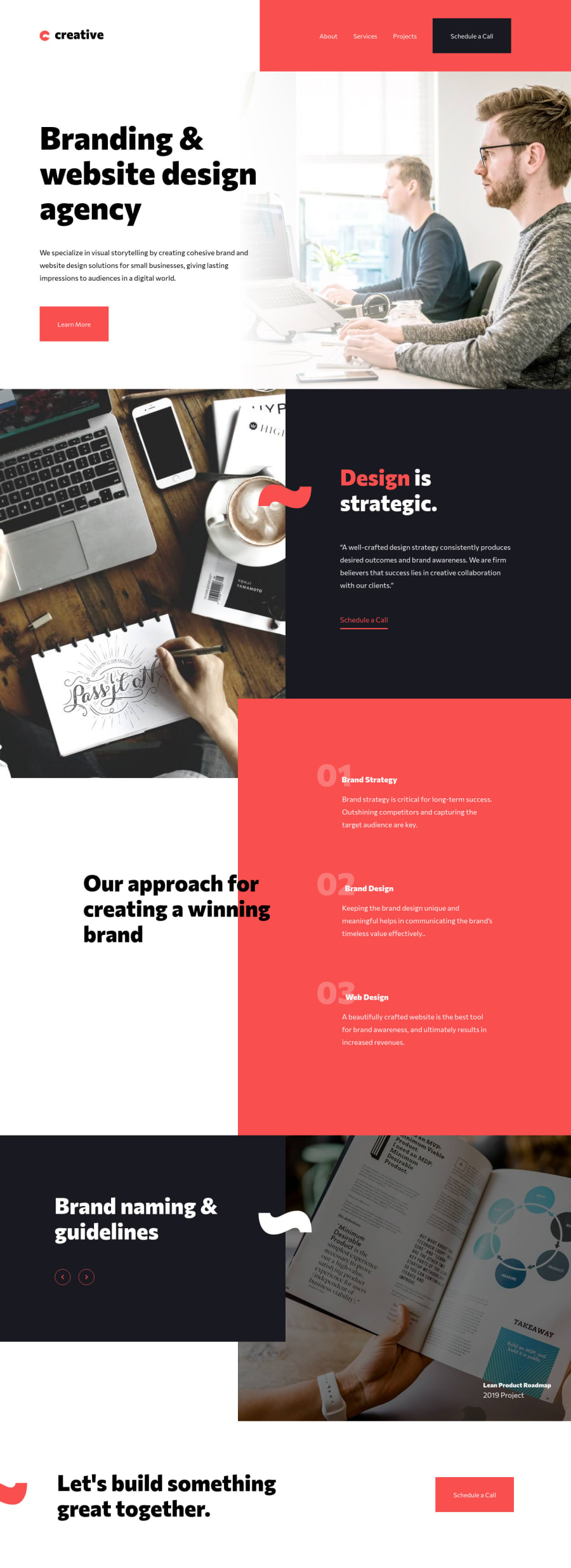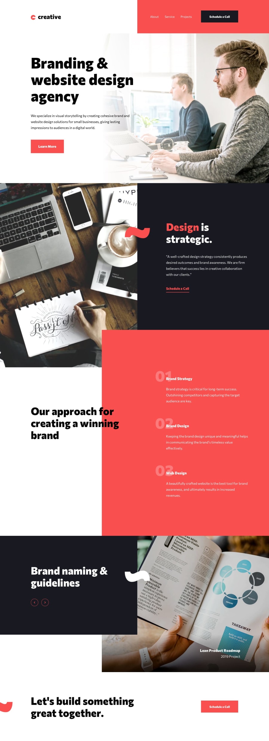
Design comparison
Solution retrospective
Pretty hard one ! Massive use of grid. I had to create a separate css file for the mobile version. All comments are welcome ! =)
Community feedback
- @ApplePieGiraffePosted almost 4 years ago
Hey, Henrique Andrade Vieira! 👋
Great job on this challenge! 👍 Your solution looks good and responds nicely! 👏
I suggest,
- Adding some space between the text content in the hero section of the page and the left side of the page so that there's always some room between the two in the desktop layout (even when the width of the screen decreases).
- Adding some hover states for the links and buttons on the page would be a nice touch! 😉
Keep coding (and happy coding, too)! 😁
And happy holidays! 🎄
1@VieiraHenriquePosted almost 4 years agoThank you very much for your comment ! You're right ! I ll do it right away ;) Happy holidays !!!
0 - @abhik-bPosted almost 4 years ago
Hi HENRIQUE, your solution is just amazing 👌👌
- it is very responsive
- it seems perfect on desktop
- your scripts.js file is empty on your repo as of now , so I guess you will make this interactive which will make this solution great🚀
You have really done a amazing job , Keep it up 💯
Also I visited your portfolio , its very nice (I got inspiration from your portfolio) and your Hangman game is mind-blowing 👏👏👏👏
1@VieiraHenriquePosted almost 4 years agoThat's so nice of you !!!!!!! Thank you so much ! Yeah... a just spent 5 hours doing the website, cracking my head... I didn't do the interactivity yet. But thank you very much for your feedback !
0
Please log in to post a comment
Log in with GitHubJoin our Discord community
Join thousands of Frontend Mentor community members taking the challenges, sharing resources, helping each other, and chatting about all things front-end!
Join our Discord
