Design comparison
SolutionDesign
Solution retrospective
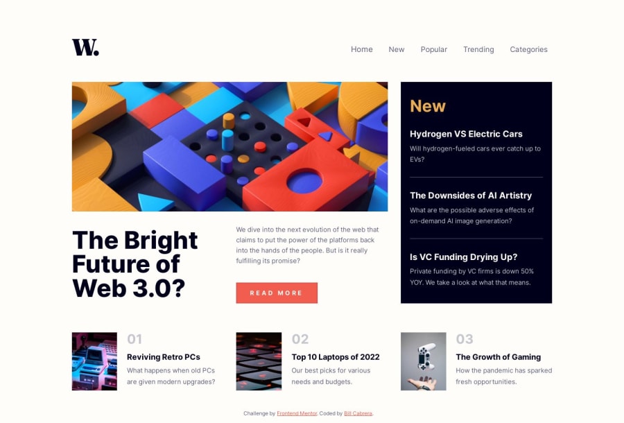
Working out the grid structure of this project was quite enjoyable. But the real challenge for me was the accessibility side of things. I'd never really committed to trying to get a handle on that before.
Doing it without using some plugin component forced me to do a bunch of research just to understand what was involved in making a website accessible for people with vision or motor obstacles.
I'm sure some my solution falls short, but I really learned so much with this one.
Community feedback
Please log in to post a comment
Log in with GitHubJoin our Discord community
Join thousands of Frontend Mentor community members taking the challenges, sharing resources, helping each other, and chatting about all things front-end!
Join our Discord
