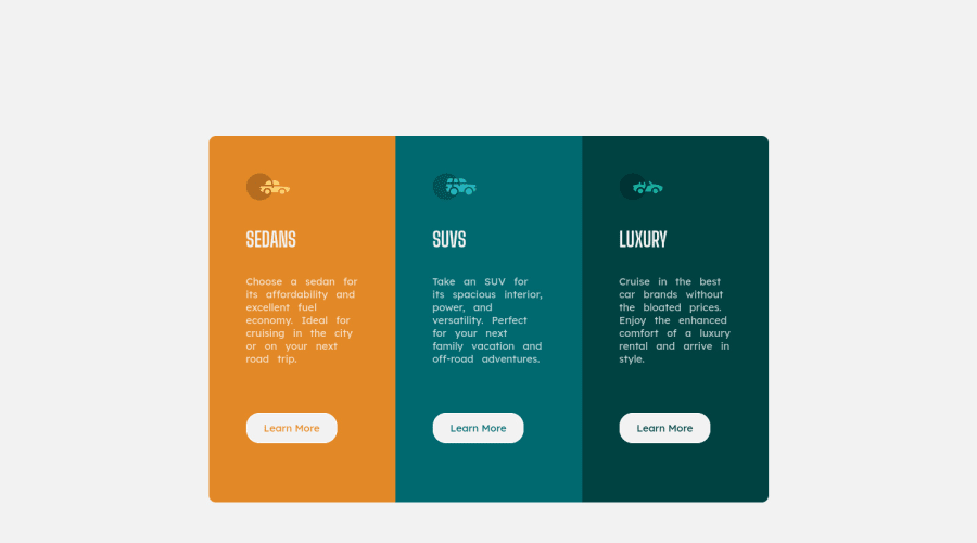
Design comparison
Solution retrospective
Hey Guys, I just finished the 3-column Preview Card Challenge. I would like you all to see it and let me know how I can improve it. Let me know my mistakes . Thank you!.
Community feedback
- @AlexKMarshallPosted about 3 years ago
Hey there, it looks good here, it works well on mobile and desktop.
There are a few things to be careful of.
Try not to use fixed heights for things. Imagine someone changed the text so that there was a lot more of it in one of the cards, because your card has a fixed height, it will now overflow and look very strange. In general you can let your containers be the size that they naturally want to be based on the content.
Avoid using fixed pixel sizes for fonts. Users may change their base font-size and we want our text to scale with that. So almost always use rem as your units for fonts.
Careful with heading semantics. There should only be one h1 on the page. Since this challenge is for a smaller component that would be part of a larger page, you can make your card headings h2's. And then you can have a screen-reader only h1 on the page giving it a title. Look up screen-reader-only utility CSS classes online for this.
The "Learn More" buttons should probably be links instead. In a real site this would likely take you to a different page with the details on it. Links are always used for navigation. Buttons are just for things that would execute something with javascript or for form submission. This one really depends on context though. If the learn more actually launched a pop up box, then a button would be the correct choice.
Marked as helpful1@karishma-devPosted about 3 years agoHi @AlexKMarshall, I want to thank you for your advice and a detailed explanation of everything. Now, I can understand certain concepts better because of you. I made all the changes, the project looks much better nowπ.
Thank you so much for taking the time to provide your feedback. π
0 - @mikib0Posted about 3 years ago
Hey @Krrish105 I have a few suggestions on your project: 1. You could set
min-height: 100vh
on main to make it take up the whole height of the device it is viewed on and again setdisplay: grid; place-items:center;
on it to center the container inside it. 2. Instead of fixing a height on the card items you can let the content inside decide the height. Apart from that, great work!. I hope my feed back helps.Marked as helpful0@karishma-devPosted about 3 years agoHi @ibrahimisa, I want to thank you for your suggestions, they really helped me to improve my project.
Thank you for taking the time to provide your feedback. :)
0
Please log in to post a comment
Log in with GitHubJoin our Discord community
Join thousands of Frontend Mentor community members taking the challenges, sharing resources, helping each other, and chatting about all things front-end!
Join our Discord