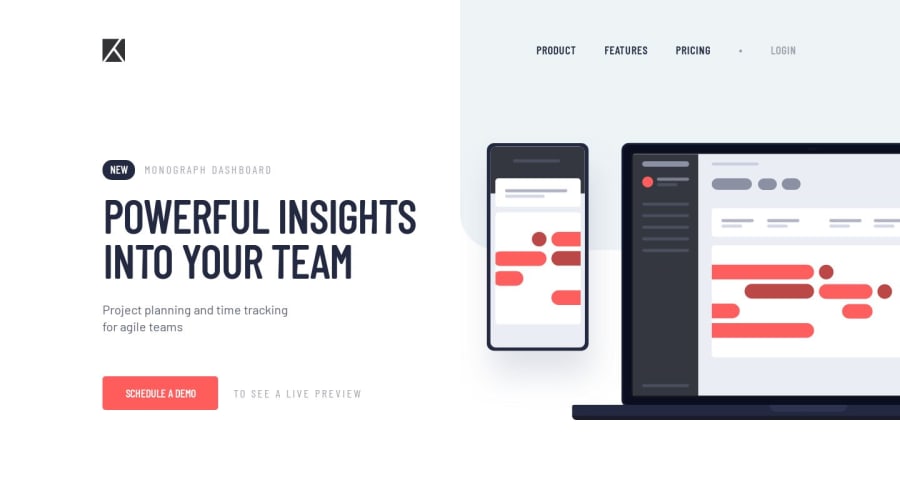
HTML, Sass and JS built with a small @keyframe animation on hero image
Design comparison
Solution retrospective
Hi there! I'm happy to receive feedback on my site. Specific areas I want to focus on are my Sass organisation and responsive breakpoints. I'm still learning to integrate Sass into my workflow and I often doubt whether I'm nesting in an efficient manner. Especially when it comes to the responsive break points. I end up prioritising readability, but find that the resulting css has a lot of duplicate sections. Any advice on how to approach this would be much appreciated.
Community feedback
- @mattstuddertPosted over 4 years ago
Nice work on this challenge, Anneta! Here are some pointers after taking a look at your code:
- Your Sass code looks fine. I'd recommend reading up on the 7:1 pattern as it can be a great way to structure your Sass code. Here's a great Medium article about the 7:1 pattern.
- I'd recommend reviewing your breakpoints one more time. Specifically at the large phone/small tablet size. For example, if you put your screen size to
600px
on your solution you'll see that there's a horizontal scroll. - I'd recommend avoiding using IDs as CSS selectors. They have high specificity and can't be reused on the page, so they're not good for the purpose of styling. Instead, I'd recommend sticking to class, attribute, pseudo, and type selectors. Using these will help keep your CSS more maintainable.
- As far as the duplicated code goes you might find it useful to try using
min-width
media queries instead ofmax-width
. It's quite a common workflow with front-end developers to use them and work mobile-first. It can often lead to less CSS code and has the benefit of loading in fewer styles for mobile users, which can be a nice performance gain.
I hope this helps. Keep up the great work and let me know if you have any questions 👍
2@annetawamonoPosted over 4 years ago@mattstuddert Thanks so much for all the feedback:) I've never tried a mobile-first approach, so thank you for bringing this to my attention.
0@mattstuddertPosted over 4 years ago@annetawamono no problem! Mobile-first is great. It can take a little bit of getting used to it. So I'd recommend trying to build 2 or 3 projects with that workflow to really evaluate it.
0
Please log in to post a comment
Log in with GitHubJoin our Discord community
Join thousands of Frontend Mentor community members taking the challenges, sharing resources, helping each other, and chatting about all things front-end!
Join our Discord