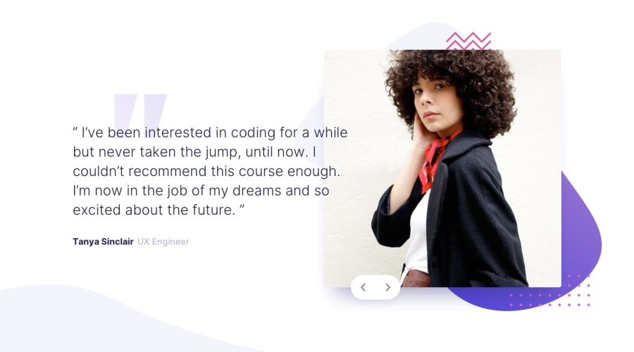
Design comparison
SolutionDesign
Solution retrospective
Hey Fellow Coders,
Just finished the Coding Bootcamp Testimonial Slider project with HTML, SASS, and Javascript for Slider. Really looking forward to getting your feedback 🔥 That would help me to develop more.
Sincerely, Akshat
Community feedback
- @mattstuddertPosted over 3 years ago
Nice work on this challenge, Akshat! You've done an excellent job, and your solution looks good vs the design. A couple of things I'd recommend looking into are:
- Avoid setting click listeners on non-interactive elements, like the
divelement. These can't be accessed by anyone not using a mouse/trackpad to navigate the content, which is a bad practice. Instead, add click listeners to interactive elements likeaorbutton. This will ensure the element is focusable and accessible by people not using a mouse/trackpad. - Also, be careful nesting selectors too much in Sass. Nesting is a great feature of Sass, but it's easy to misuse, leading to overly specific selectors. For example, your
.testimonial-container .testimonial .testimonial-textselector could simply be.testimonial-text. With CSS selectors, you always want to make them specific enough to style the element, but not too specific where it can become hard to override with other styles.
I hope that helps. Keep up the great work! 👍
1@vishwa-akshatPosted over 3 years ago@mattstuddert Thank you sir for taking your time to give me feedback. I will keep in mind to improve these aspects in my codes.
0 - Avoid setting click listeners on non-interactive elements, like the
Please log in to post a comment
Log in with GitHubJoin our Discord community
Join thousands of Frontend Mentor community members taking the challenges, sharing resources, helping each other, and chatting about all things front-end!
Join our Discord
