Design comparison
SolutionDesign
Solution retrospective
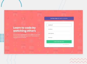
Hello, For this project I aimed to utilize more responsive units (rems in this case).
I am calculating them on the fly using a Sass function. If you notice any improvements that could have been made in regards to Sass and responsive units feel free to let me know.
This time I also developed in the order of Mobile -> Tablet -> Desktop with more of an emphasis on making sure the design remained acceptable during resizes etc. If you have any design approach suggestions I am all ears.
Also anything else that stands out don't hesitate to point it out. I'd really appreciate it.
Thanks everyone
Community feedback
Please log in to post a comment
Log in with GitHubJoin our Discord community
Join thousands of Frontend Mentor community members taking the challenges, sharing resources, helping each other, and chatting about all things front-end!
Join our Discord
