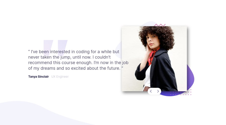
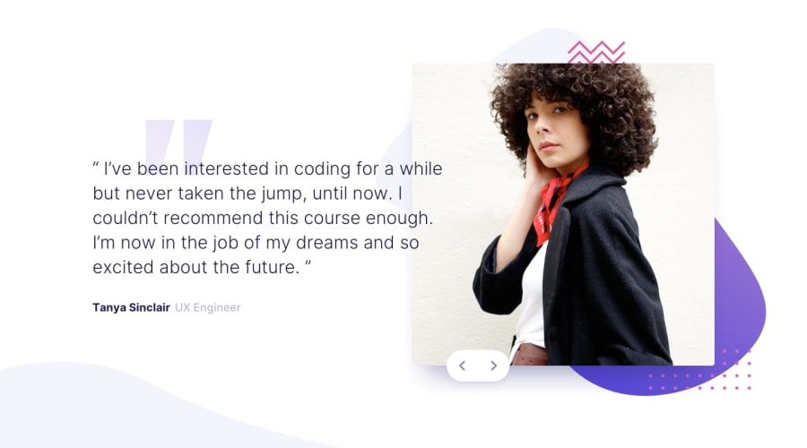
Not Found
Not Found
Not Found
Not Found
Not Found
Not Found
Not Found
Not Found
Not Found
Not Found
Not Found
Not Found
Not Found
Not Found
Not Found
Not Found
Not Found
Not Found
Not Found
Not Found

Submitted

HTML. SASS, and Javascript

@fazzaamiarso

Desktop design screenshot for the Coding bootcamp testimonials slider coding challenge

This is a solution for...

  • HTML
  • CSS
  • JS
2junior
View challenge

Design comparison


SolutionDesign

Solution retrospective


Hello!! Would love some feedback on my code. Especially on how the layout is done. Thank you in advance!!

Community feedback

@pikapikamart

Posted

Hey, great work on this one. Layout is really great both mobile and desktop. Also the responsiveness is good.

Some suggestions would be that:

  • on the body tag, you could remove the overflow: hidden declaration. I see that you use this to hide the extra spacing at the bottom right. To fix that, just add a align-items: flex-start on your main tag. The reason that happens is that, at default, display: flex gives the layout a default align-items: stretch

This makes the layout or the item of the flexbox have the same size based on the largest or highest element inside of it. Since the highest (based on height) is the image, the text on the left side gets that size as well. And since you are using position: relative and top on the container on the left side, it pushes it down and creating extra space at the bottom. align-items: flex-start fixes that by only giving every element in the flexbox the height, based on the content of the element.

  • your slider togglers, the arrows, it is better to use button on it, wrapping the img of the arrowinside thebuttonso that it have extra accessibility, like when you usetab` on your keyboard to navigate.
  • The name of the person who said the testimonial could be wrap inside a heading tag like h2
  • Also, when creating website, it is convention to have atleast 1 h1 tag. On your solution, maybe adding a h1 tag inside the main tag, having the text like testimonials or any descriptive text that describes your website. But this h1 will only be for screen reader users, so this h1 will have a sr-only class, you can search only for sr-class. This is just css stylings that are intended for screen reader users.

Overall, you did great on this, especially on responsiveness.

Marked as helpful

0

@fazzaamiarso

Posted

@pikamart Hello!! Thank you so much for your comprehensive feedback and time. There is a lot of things that I was unaware of and missed here. Hope you have a good day!!

0

Please log in to post a comment

Log in with GitHub
Discord logo

Join our Discord community

Join thousands of Frontend Mentor community members taking the challenges, sharing resources, helping each other, and chatting about all things front-end!

Join our Discord