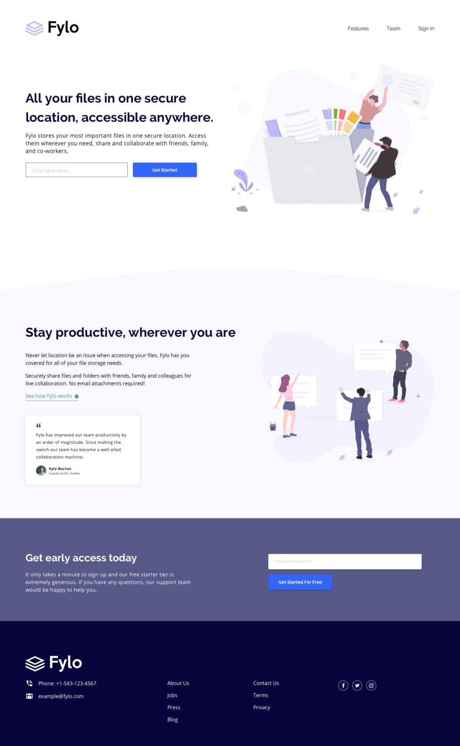
Design comparison
SolutionDesign
Community feedback
- @jemeneradevPosted about 4 years ago
Ah man, this challenge looks like a fun one. A few improvements that I can think of are:
-
Increase the font weight of the " Features Team Signin" Menu. In the design version, the letters are bit thicker.
-
Add a border to the email input.
Good Job!
1@AndreaLecuonaPosted about 4 years ago@jemeneradev Indeed, this was a fun one! Thank you so much for your feedback, I'll apply your improvements very soon. Have a nice day!
1 -
Please log in to post a comment
Log in with GitHubJoin our Discord community
Join thousands of Frontend Mentor community members taking the challenges, sharing resources, helping each other, and chatting about all things front-end!
Join our Discord
