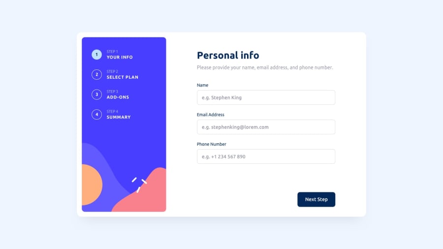
html, React.js, javaScript, css flex-box, vanila react code
Design comparison
Solution retrospective
Probably the best Solution
Please GO through the user flow once!!! I have crafted a good user experience!
I didn't follow the style exactly; instead, I have improved upon it!!
YOU WILL LOVE IT!!
Community feedback
- @seezmashelePosted over 1 year ago
Hey Siddarth, great job on completing this complex challenge😃
The way you've used animations really made the form exciting to fill out!
A few tips you can consider to make things easier for users:
- Saving what users type or select when moving back and forward
- Selecting an addon by clicking the whole card instead of the small checkbox
- Allowing + in the phone number check
I hope this feedback can help you in future projects as well🤓 Happy coding!
1@Sidd5arthPosted over 1 year ago@seezmashele Hi, thanks for the suggestion! that's exactly what I was thinking before posting this solution, nevertheless I will make those changes. And yes I missed the + there
0
Please log in to post a comment
Log in with GitHubJoin our Discord community
Join thousands of Frontend Mentor community members taking the challenges, sharing resources, helping each other, and chatting about all things front-end!
Join our Discord
