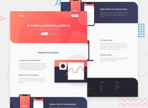
Design comparison
Solution retrospective
This project looked simple enough but really gave me one heck of a challenge. I believe this project would have been completed sooner had it not been for the issues i experienced with building the navigation bar. Please let me know what you think about my own version of this project. Thank you !
Community feedback
- @ChamuMutezvaPosted over 3 years ago
- avoid writing in uppercase , content written in uppercase is difficult to read and is considered
shoutingin some circles.
a lot of things has to change in your code.
- can this be a heading
<h1 class="brand-name">Blogr</h1>, in my opinion i would prefer to use it as a logo. There is an svg logo in the assets.
<div class="hamburger-icon"> <div class="line line-1"></div> <div class="line line-2"></div> <div class="line line-3"></div> </div>- the hamburger will not be able to be used by keyboard users. That should have been a button.
- the best practice is to use only one
h1element on a page, using more than one h1 is not recommended
<div class="second-container-img"> <img src="images/illustration-editor-mobile.svg" alt=""class="illustration-editor-mobile"> <img src="images/illustration-editor-desktop.svg" alt="" class="illustration-editor-desktop"> </div>- the above method is not part of responsive images, it wastes bandwidth and is considered expensive. Read about scrset and picture element which allows users to have only the right image to be downloaded according to their device
- format your code so that it is easy to read and follow
- generally the site is responsive , but some wide section of empty spaces concerns me.
Good lucky
Marked as helpful1@radikhalPosted over 3 years agoHello @ChamuMutezva
Thank you for your response.
In regards to writing in uppercase letters i will not be making that mistake next time. you absolutely a made valid point.
-
In regards to the svg logo, i did not see any in the folder that was downloaded so i proceeded to work without it. if you had an svg logo to work with please let me know.
-
As for the hamburger menu icon i created, i did not know that it cannot be used by keyboard users. now i know better and will use a proper button next time.
3)Your explanation on the h1 element is also well noted and will be applied henceforth.
-
i have heard about scrset and will read about it and apply it in my future projects.
-
how do i format my code so it is easy to read. how do i go about that ? i would not mind if you could point me towards a few resources i can learn from on how to format my code for better readability.
-
you mentioned seeing empty white spaces.. i know i could have done better with the overall design but i just wanted to get the project done by any means necessary mostly because it really challenged me to the point i got tired and unmotivated. i will do much better on future projects as working on this project has undoubtedly made me a better developer.
0 - avoid writing in uppercase , content written in uppercase is difficult to read and is considered
- @ChamuMutezvaPosted over 3 years ago
If you are using visual studio code editor for formatting , check and search for
extensionsone of them is vs code formatter.0@radikhalPosted over 3 years ago@ChamuMutezva Okay.. Thank you, I will download the extension
0
Please log in to post a comment
Log in with GitHubJoin our Discord community
Join thousands of Frontend Mentor community members taking the challenges, sharing resources, helping each other, and chatting about all things front-end!
Join our Discord
