HTML Markup with CSS Flexbox and variables for colours
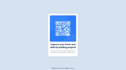
Design comparison
Solution retrospective
I am proud of the fact that I was able to complete this challenge within a day. I had to take a break from web development for personal reasons. Jumping back into the workflow, I am somewhat "rusty"; however, there were many HTML and CSS practices that I was familiar with and recognized immediately.
What challenges did you encounter, and how did you overcome them?I am proud of the fact that I was able to overcome the image exploding from the container roadblock. In addition, I was able to reduce the qr code component to a reasonable size relative to the entire entir viewport.
What specific areas of your project would you like help with?Any suggestions for general HTML and CSS improvements are welcome. I am always looking to make my markup more efficient.
I am seeking feedback on how I can make further improvements to refine the design, styling and possibly adding features in the future to make the component more useful.
I am also open to adding animations and states to make the component more dynamic.
Community feedback
- @EFEELEPosted 6 months ago
I'm very glad to see you back in web development!! One never stops learning, congratulations!!
In terms of styles, at first glance, I would recommend reducing the opacity of your box-shadow and perhaps setting it to something like 1px 1px 15px hsl(220deg 15% 55% / 20%), i would also slightly decrease the border-radius.
In terms of HTML, I would recommend changing your h2 to h1, remembering that this helps with SEO.
And as extras, try this to add a special touch to your project:
Remember, you can add active states to your elements using the pseudo-selector :hover
main.qr-container:hover { /* These styles will only be displayed when hovering */ transform: scale(1.02); /* We change the size to make the element a little bigger */ transition: .3s ease; /* we added a transition so that the changes are not so abrupt */ cursor: pointer; /* This will change the cursor type */ box-shadow: 1px 1px 15px hsl(220deg 15% 55% / 50%); /*I would recommend making the shadow darker when in hover. */ }
I hope this is very helpful for you, friend!! Lastly, since you're returning to this, I recommend studying flexbox. It will allow you to create almost any interface with CSS.
Marked as helpful0@LawrenceLCodesPosted 6 months ago@EFEELE
Thank you for the feedback and suggestions! I am working on the fixes now. In addition, the use of hover is also a good idea. Looking at how I can implement it into the design.
0 - @geomydasPosted 6 months ago
Your HTML is filled with div tags to contain an element which doesn't even need it. Every img, h1, p element has a div tag and it doesn't really have any use. Just apply the CSS directly to that element, not on a parent.
Also, change that h2 tag into an h1. SEO-wise and accesibility-wise. You would usually just use an h2 tag for a subheading.
For box shadow, I'd reccomend using https://cssmatic.com/box-shadow. It is much easier than doing it manually and you can see it live.
"I am also open to adding animations and states to make the component more dynamic." Use the hover: pseudo selector in CSS if you want to do so
0@LawrenceLCodesPosted 6 months ago@geomydas
Thank you for the feedback and for suggestions on how to improve my HTML. The header has been changed to h1. Refactoring my HTML will require some tweaking, so I will look at making those changes later.
I also appreciate the CSS matic web utility. Looking forward to playing around with the tool to see what I can do to improve the box-shadow.
I did find the hover state. Will look into integrating it as well.
0 - @saifuldtPosted 6 months ago
your design is good but heading color is not macth . fix it to locking very beautiful
0@LawrenceLCodesPosted 6 months ago@saifuldt
Thank you for catching that discrepancy. I have changed the header colour to Dark blue: hsl(218, 44%, 22%), which was included in the style guide.
0
Please log in to post a comment
Log in with GitHubJoin our Discord community
Join thousands of Frontend Mentor community members taking the challenges, sharing resources, helping each other, and chatting about all things front-end!
Join our Discord