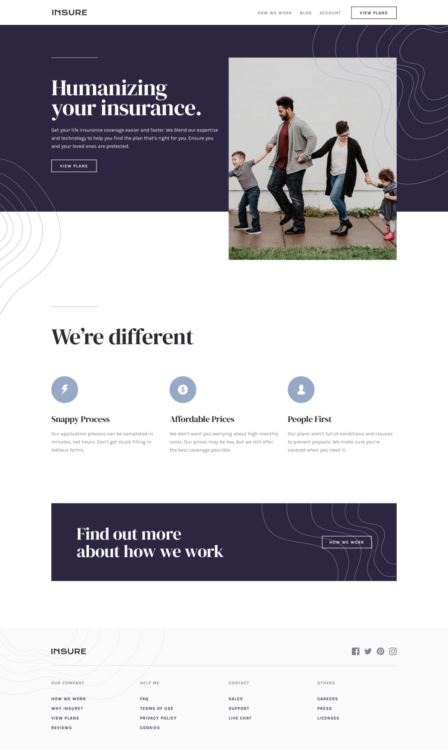
Design comparison
SolutionDesign
Solution retrospective
Hi everyone! I have struggled with some parts of this challenge, specially with the positioning of some of the overlapping elements. I had some issues with the desktop version of the challenge since a white space was showing up on the right side of the screen. I managed to "fix" this applying overflow-x: hidden; in the body tag. I can't figure out why this was happening and my code might show some problems adapting to different screen sizes. I would appreciate some feedback on these issues. Thank you!!
Community feedback
Please log in to post a comment
Log in with GitHubJoin our Discord community
Join thousands of Frontend Mentor community members taking the challenges, sharing resources, helping each other, and chatting about all things front-end!
Join our Discord
