Submitted about 3 years ago
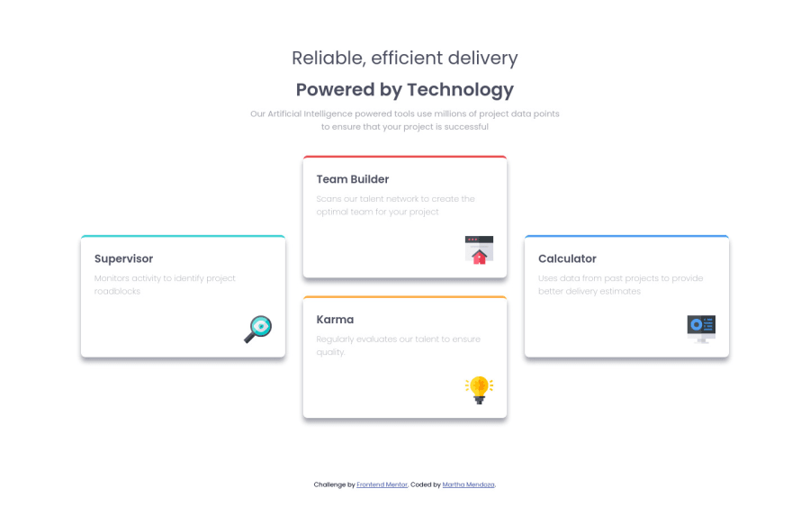
Four card feature section using html, js, css flexbox and grid
@Mtc-21
Design comparison
SolutionDesign
Solution retrospective
What could be the possible improvements?
Community feedback
- @pikapikamartPosted about 3 years ago
Hey, awesome work on this one. Layout looks really great in desktop, it is responsive and the mobile state looks great as well.
Just a small suggestion/s.
- This text
Reliable, efficient delivery Powered by Technologyis really a one sentence and not separated, hence using onlyh1to wrap both of these would be great. Then to make theh1text be wrapped, usemax-widthon it and adjust until you get the desired look then lastly addmargin: 0 autoto center it. - Also when you use
h1on that, remember to change thoseh3intoh2on each of the cards at the bottom.
Aside from those, great job again on this one.
Marked as helpful0@Mtc-21Posted about 3 years ago@pikamart Hi, I really appreciate you sharing your knowledge, apply the suggestions.
thank you 👍
1 - This text
Please log in to post a comment
Log in with GitHubJoin our Discord community
Join thousands of Frontend Mentor community members taking the challenges, sharing resources, helping each other, and chatting about all things front-end!
Join our Discord
