

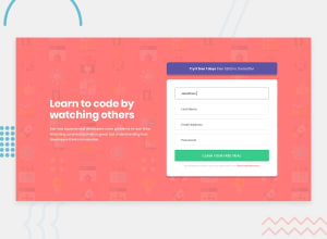
Design comparison
SolutionDesign

Solution retrospective
I will appreciate any feedback or suggestion. THX
Community feedback
- @FluffyKasPosted about 3 years ago
Hiya, your solution looks really good! There's a few small improvements you could make though:
- The padding-top on your form could be a bit bigger.
2/ The header title's font-size could be a bit bigger too.
- Perhaps theres too much space between the button and the terms&services text!
Marked as helpful0

Please log in to post a comment
Log in with GitHubJoin our Discord community
Join thousands of Frontend Mentor community members taking the challenges, sharing resources, helping each other, and chatting about all things front-end!
Join our Discord