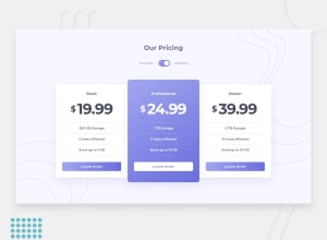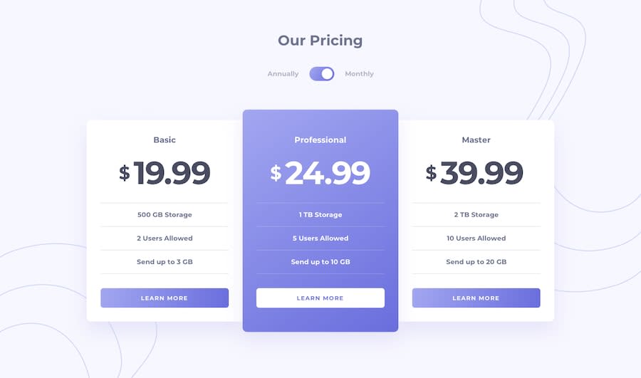
Design comparison
SolutionDesign
Solution retrospective
hello fellow devs, hope you are having a good day !!! any feedback will be highly appreciated!
Community feedback
- @ApplePieGiraffePosted almost 4 years ago
Hello, Mansoor Roeen! 👋
Nice to see you complete another challenge! 😀 Good job on this one! 👏
A few things I'd like to suggest are,
- Making the toggle-switch tabbable so that keyboard users can access and use that toggle-switch.
- Adding a title to the page using the
<title>tag. - Adding some space below the pricing cards using margin or padding to ensure that there is always some room between those cards and the bottom of the page. 😉
- Allowing users to vertically scroll on the page so that they do not miss out on any of the content if it happens to be beyond their viewport.
Keep coding (and happy coding, too)! 😁
Oh, and hey, if you found this comment helpful, an upvote would be appreciated! ;)
1
Please log in to post a comment
Log in with GitHubJoin our Discord community
Join thousands of Frontend Mentor community members taking the challenges, sharing resources, helping each other, and chatting about all things front-end!
Join our Discord
