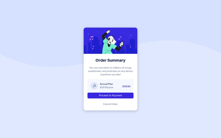
Design comparison
Solution retrospective
How can I improve the design for Mobile devices? Is there anything to improve for the desktop version?
Community feedback
- @Jawha3Posted over 3 years ago
Hello Mainul-Islam, I took a quick look at your solution and a few things stood out to me that might help you in the future.:
I noticed your background picture is cutting off at the 1440px mark. I know the style-guide.md says the design was made in that width - but I do think it would look better with a fullsize background (I believe this can be done by adding "background-size: 100%" to the element.)
You should try and make a seperate folder or at least a seperate file for the css and then link it through your html. It makes it more neat.
What I'm trying to learn myself and suggest you try as well is using "rem" and "em" where approbiate instead of "px".
And lastly I would suggest that you use the index.html file you get from the downloading of the challenge (this may just be me - but when I see something slightly different to the design it bugs me :3)
As I mentioned I only took a quick look so I may have overlooked something. I also want to point out that I'm not an expert on the subject - but have been learning for a little while.
As for the mobile version I think it looks good - the issue is more with the desktop version as your solution is slightly smaller than the design but otherwise I think it looks great :)
Marked as helpful1@Mainul-Islam-NirobPosted over 3 years ago@Jawha3 Thanks, Jannie Hansen. I will try to follow your instruction and fix my code.Thanks again for the feedback. It will be helpful for me.
0
Please log in to post a comment
Log in with GitHubJoin our Discord community
Join thousands of Frontend Mentor community members taking the challenges, sharing resources, helping each other, and chatting about all things front-end!
Join our Discord
