

Design comparison
SolutionDesign

Solution retrospective
What are you most proud of, and what would you do differently next time?
I'm proud of how well the site turn out to be without figma designs.
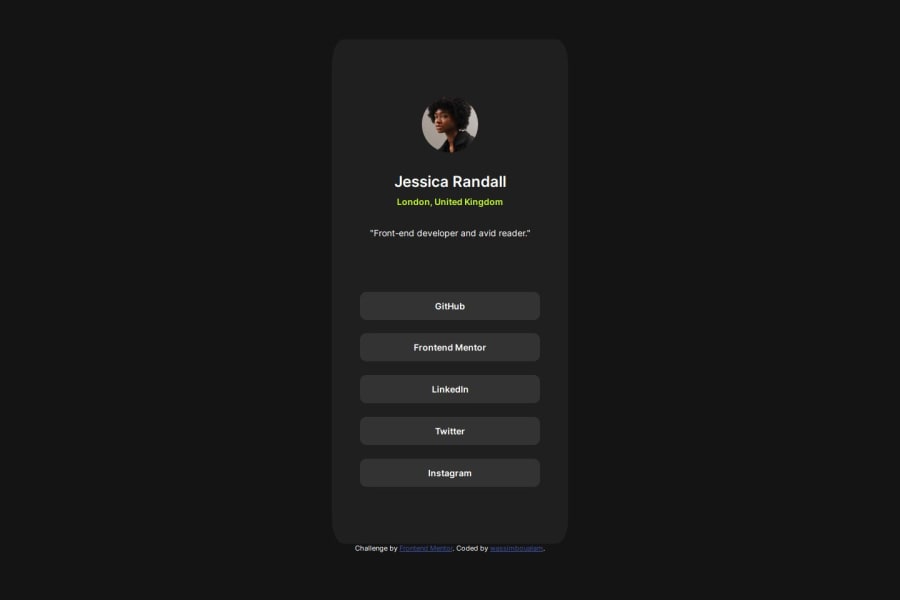
What challenges did you encounter, and how did you overcome them?Among the challenges was getting the site to have the same proportions as the design, it was tough relying on a single picture with no details.
What I did to solve this was write a tkinter app with the design on it ,so that I can overlap it with how the site looked like and get it as close as possible to the design.
What specific areas of your project would you like help with?Nothing really.
Community feedback
Please log in to post a comment
Log in with GitHubJoin our Discord community
Join thousands of Frontend Mentor community members taking the challenges, sharing resources, helping each other, and chatting about all things front-end!
Join our Discord