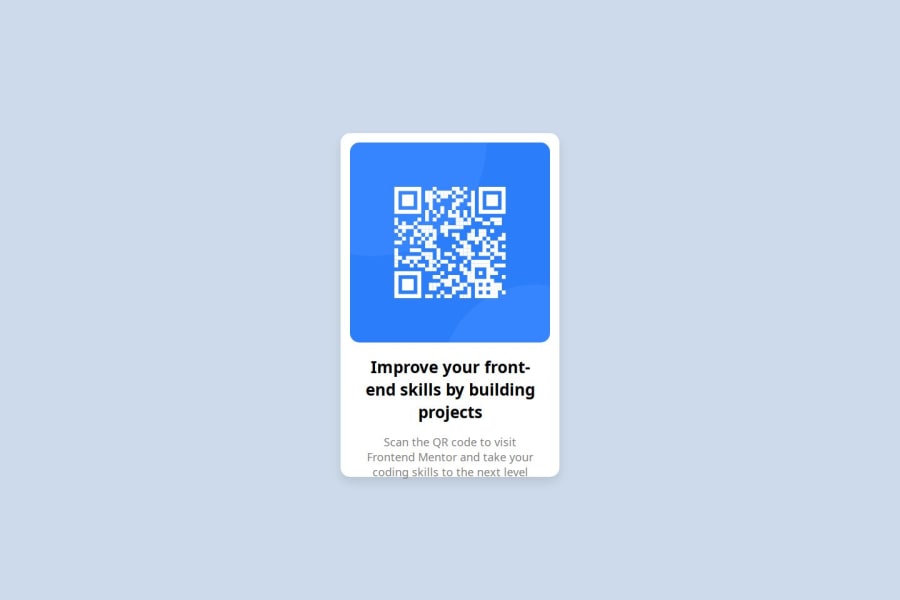


Design comparison

Community feedback
- P@StroudyPosted 7 months ago
Awesome job tackling this challenge! You’re doing amazing, and I wanted to share a couple of suggestions that might help refine your approach…
-
Using a
<main>tag inside the<body>of your HTML is a best practice because it clearly identifies the main content of your page. This helps with accessibility and improves how search engines understand your content. -
Having a clear and descriptive
alttext for images is important because it helps people who use screen readers understand the content, making your site more accessible. It also improves SEO, as search engines usealttext to understand the image's context, helping your site rank better, Check this out Write helpful Alt Text to describe images, -
Using a full modern CSS reset is beneficial because it removes default browser styling, creating a consistent starting point for your design across all browsers. It helps avoid unexpected layout issues and makes your styles more predictable, ensuring a uniform appearance on different devices and platforms, check out this site for a Full modern reset
-
Developers should avoid using pixels (
px) because they are a fixed size and don't scale well on different devices. Instead, useremorem, which are relative units that adjust based on user settings, making your design more flexible, responsive, and accessible. For more information check out this, Why font-size must NEVER be in pixels or this video by Kevin Powell CSS em and rem explained.- Another great resource for px to rem converter. -
Using
max-width: 100%ormin-width: 100%is more responsive than justwidth: 100%because they allow elements to adjust better to different screen sizes. To learn more, check out this article: responsive-meaning. -
For future project, You could downloading and host your own fonts using
@font-faceimproves website performance by reducing external requests, provides more control over font usage, ensures consistency across browsers, enhances offline availability, and avoids potential issues if third-party font services become unavailable. Place to get .woff2 fonts
You’re doing fantastic! I hope these tips help you as you continue your coding journey. Stay curious and keep experimenting—every challenge is an opportunity to learn. Have fun, and keep coding with confidence! 🌟
0 -
- @TheTrueScoutPosted 7 months ago
It looks like you set a height on the container. Sometime's that's bad practice because you limit things unnecessarily. Remove the height, and add more padding to the bottom and you'll be a'ok.
I just looked at the live site, and it looks like that has already been fixed- which is good. ( the code still has a fixed height, but if it works, it works :). )
Learn how to use flex boxes. It will make your life much easier.
You can use margin: 15px 0 15px 0; in order of Top, Right, Bottom, Left instead of using margin left, or margin top on separate lines.
Styling the image is unnecessary. adding a border radius is enough.
You didn't add the designated challenge font.
0


Please log in to post a comment
Log in with GitHub
Join our Discord community
Join thousands of Frontend Mentor community members taking the challenges, sharing resources, helping each other, and chatting about all things front-end!
Join our Discord