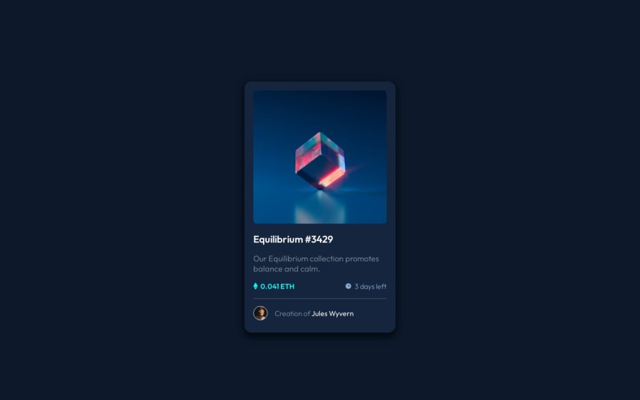
Design comparison
Solution retrospective
Overall, I think I did pretty well.
Blockers:
- I keep forgetting the values for SVG viewBox. I wasn't able to successfully use
<i>
or<svg>
, so I just stuck with<img>
- Had some trouble with the overlay positioning
- Spent an unreasonable amount of time trying to figure out whether or not the font-weight for "Jules Wyvern" was 300 or 400 (still unsure)
Please let me know if there are any discrepancies or if you have any advice for me to improve my code.
Community feedback
- @radektomasekPosted over 1 year ago
Hello Nathan 👋,
had a chance to have a look at your solution and let me first walk through the items you mentioned in the blockers section:
-
You should be able to use SVG in a static document. Checkout this article. Just one note, don't use
<i>
tag. I know this is sometimes utilized when people are usingFont Awesome
, buti != image/icon
. It's an old tag pre HTML5 which was used for italic texts. It's used with icons but it shouldn't. https://stackoverflow.com/questions/17471390/how-to-use-i-tag-with-icons. Using anSVG
orimg
should work. If an SVG doesn't work, double-check the export. -
The overlay position. Do you still have a problem? I looked into the preview site and it looks great.
-
Re: "Jules Wyvern": I have access to figma and the particular section should be
400
.
And here is a bit of an observation
-
CSS looks good, but I think you should consider utilizing CSS variables to reduce some duplicities.
-
You shouldn't use absolute values for font sizes. The reason is accessibility. Here is a good article about it.
-
You might also double the
line-height
. The frontend mentor challenges usually have some tweaks in it. If you specify it, use a ration value rather than a specific unit. Another good article related to this.
But in general, you had done a great job, especially as this has been your first challenge solution.
0@nathanro09Posted over 1 year ago@radektomasek Thanks for the feedback! I didn't know about the
<i>
tag, so I'll have to remember that for the future. I figured out the overlay position, just had some trouble figuring it out. For the font sizes, I used 18px for the body as stated in the guidelines, but I probably should have converted it into responsive values. Thank you for pointing that out, I usually never use absolute values for font sizes. Also, thank you for the articles, they were all good reads and will definitely be helpful in the future!1 -
Please log in to post a comment
Log in with GitHubJoin our Discord community
Join thousands of Frontend Mentor community members taking the challenges, sharing resources, helping each other, and chatting about all things front-end!
Join our Discord