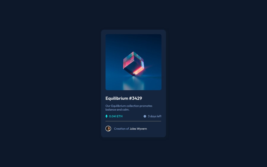
Not Found
Not Found
Not Found
Not Found
Not Found
Not Found
Not Found
Not Found
Not Found
Not Found
Not Found
Not Found
Not Found
Not Found
Not Found
Not Found
Not Found
Not Found
Not Found
Not Found

Submitted

Html e Css

@TiagoHenrique10

Desktop design screenshot for the NFT preview card component coding challenge

This is a solution for...

  • HTML
  • CSS
1newbie
View challenge

Design comparison


SolutionDesign

Solution retrospective


1 - Parecia ser simples o card mas tive duvidas na hora da construção do html para obter algo semântico.

2 - No status de ação para sobrepor uma imagem sobre a outra tbm tive dificuldades para entender como faria isso e deixar o posicionamento correto.

3 - Na responsividade quando vai obtendo menores resoluções o card da uma leve deslocada para o lado não ficando totalmente centralizado

Community feedback

Adriano 34,090

@AdrianoEscarabote

Posted

Olá Tiago, Tudo bem? Gostei bastante do seu código e do seu layout, mas tenho algumas dicas para você:

1- Vi que você estava tendo dificuldades para centralizar o layout em resoluções menores, conferi o código e fiz algumas mudanças:

fiz algumas mudanças no seu último media query:


  .informations {
       padding: 0 10px;
       flex-wrap: wrap;
       justify-content: space-evenly;
   }

   .information-right {
       color:hsl(215, 51%, 70%);
       display: flex;
       align-items: center;
       margin: 0;
   }

   .information-left { margin: 0;  }

   .avatar {
       margin: 0;
       display: flex;
       align-items: center;
       justify-content:center;
       padding-bottom: 20px;
       flex-wrap: wrap;
   }

   .avatar span {   text-lign:center;    padding: 10px;   }```
   
   
Percebi que você usou muita margin tente evitar um pouco.    
Espero que ajude 👍

Marked as helpful

1

@TiagoHenrique10

Posted

@AdrianoEscarabote Então Adriano estava mantendo o alinhamento da imagem, a discrição e por isso usei margens mas muito obrigado pela dica.

1
PhoenixDev22 16,950

@PhoenixDev22

Posted

Hi Tiago Henrique,

Great work! Congratulation on completing this challenge. I have some suggestions regarding your solution if you don't mind:

  • The most important part in this challenge is the interactive element. Since there's a :hover state on the image and means it's interactive, So there should be an interactive element around it. When you create a component that could be interacted with a user , always remember to include interactive elements like(button, textarea,input, ..) For this imagine what would happen when you click on the image, there are two possible ways:

1: If clicking the image would show a popup where the user can see the full NFT, here you use <button>.

2:If clicking the image would navigate the user to another page to see the NFT, here use <a>.

  • The link wrapping the equilibrium image (image-equilibrium ) should either have Sr-only text, an aria-label that indicates where the link navigate the user(not describes the image).
  • In class="description", never use <div> and <span> alone to wrap a meaningful content. Just keep in mind that you should usually use semantic HTML in place of the div tag unless none of them (the semantic tags) really match the content to group together. By adding semantic tags to your document, you provide additional information about the document, which aids in communication.
  • If you wish to draw a horizontal line, you should do so using appropriate CSS. You may remove the <hr>, you can use border-top: to the avatar's part.
  • For any decorative images, each img tag should have empty alt="" and add aria-hidden="true" attributes to make all web assistive technologies such as screen reader ignore those images in (icon-view, icon-ethereum, icon-clock).
  • You can use unordered list<ul> to wrap class="informations". In each <li> should be <img> and <p>, then you may use flex properties to align them centrally.
  • There are so many ways to add the hover effect on the image , The one I would use, using pseudo-elements to change the teal bg color to a hsla. Then opacity can be changed from 0 to 1 on the pseudo element on hover. There is no need for a extra clutter in the HTML. The icon view doesn’t really need to be in the HTML. You can use CSS for it.

Aside these, Great job on this. Hopefully this feedback helps

1

Please log in to post a comment

Log in with GitHub
Discord logo

Join our Discord community

Join thousands of Frontend Mentor community members taking the challenges, sharing resources, helping each other, and chatting about all things front-end!

Join our Discord