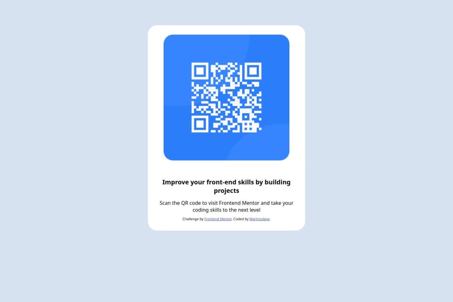
Design comparison
Solution retrospective
Sim eu me orgulho, mais um desafio concluído. Sim eu faria diferente, não consegui colocar 100% no centro da tela.
What challenges did you encounter, and how did you overcome them?Não consegui colocar 100% no centro da tela, então coloquei margin 100px auto
What specific areas of your project would you like help with?A semântica e em uma estilização melhorada, não sei se a estilização ficou muito bonita.
Community feedback
- @SvitlanaSuslenkovaPosted 7 months ago
body { display: flex; flex-direction: column; justify-content: center; align-items: center; min-height: 100vh; } Try this to align(top-bottom) and justify(left-right) your project to the center. It applies to the parent component(body), don't forget about !!min-height!!. You can use grid instead of flex too.
Hope you found this comment helpful :)
Marked as helpful0 - @AlexGulashviliPosted 7 months ago
Hey, I see you have some sizing problem. I think you have made it with yourself without Figma app. They have Figma zips that you can download, it will help you to make sizing better.
Marked as helpful0
Please log in to post a comment
Log in with GitHubJoin our Discord community
Join thousands of Frontend Mentor community members taking the challenges, sharing resources, helping each other, and chatting about all things front-end!
Join our Discord
