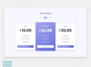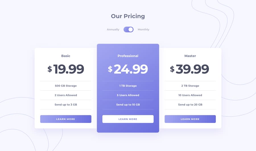
Design comparison
Solution retrospective
I have finished another challenge. Please see my work and give me feedback. Any feedback will be very thankful to me. Thanks!
Community feedback
- @grace-snowPosted almost 4 years ago
Hi Sergey,
This looks great but isn't fully accessible at the moment. The toggle button isn't able to announce it's state. With your current markup, this is what a screen reader will say:
- Annually, clickable
- Pricing toggle switch, selected, toggle button
- Monthly, clickable
Then after clicking it, it will still say:
- Annually, clickable
- Pricing toggle switch, selected, toggle button
- Monthly, clickable
There is no association between that button being pressed (it is not changing its pressed state on click) and the two additional labels. So a user can only guess what prices they'll hear.
To make this accessible, you have a few options
- Keep the button method but try the following tweaks (I've never used this method for a toggle so recommend you read up on it elsewhere first)
- toggle the pressed state on click
- add some screenreader only text (visually hidden) that announces the current state and is linked to the button. i.e. Add to the button
aria-describedby="current-state"then place an element next to it like<span class="sr-only" id="current-state" aria-live="polite">Showing Monthly Prices</span> - Toggle the innerHTML / innerText of that span to say which type of pricing is being shown
-
Swap for a checkbox version (although a lot of the above will still apply, as the button pressed is basically acting the same as a checkbox). I like this approach when there is a clear on/off state for a toggle, which mirrors how a checkbox is selected/unselected. I use this sometimes in things like settings pages.
-
Swap for a radio button version. Personally, this is always my preferred option for a toggle that has 2 explicit choices like in this design. That's how I did it in my solution for this challenge if you want to take a look. It's nice because the annually and monthly labels are always clearly linked to the currently selected radio.
I hope all that makes sense and is helpful. Really nice looking solution, this would just finish it off :)
1
Please log in to post a comment
Log in with GitHubJoin our Discord community
Join thousands of Frontend Mentor community members taking the challenges, sharing resources, helping each other, and chatting about all things front-end!
Join our Discord
