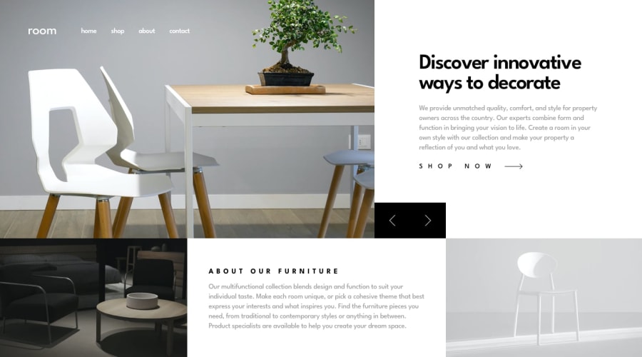
Design comparison
Solution retrospective
well despite having sever toothache I finished the project and didn't procrastinate it !
What challenges did you encounter, and how did you overcome them?I did not face any challenges just regular coding !
What specific areas of your project would you like help with?any suggestion is welcome !
Community feedback
- @TheBeyonder616Posted 3 months ago
Congratulations on your website, I just have some suggestion. Add transition to to make the scroll smooth, also you didn't get the width right.
0@samir-DevePosted 3 months ago@TheBeyonder616 thanks for your time to comment, which width are referring to could you be a little bit specific please ?!
0@TheBeyonder616Posted 3 months ago@samir-Deve you are welcome the width of About our furniture should be 1.5fr and the two images by both side should be half of that , you should also use an aspect ratio on the images, that would help you can read more about aspect-ratio.
0
Please log in to post a comment
Log in with GitHubJoin our Discord community
Join thousands of Frontend Mentor community members taking the challenges, sharing resources, helping each other, and chatting about all things front-end!
Join our Discord
