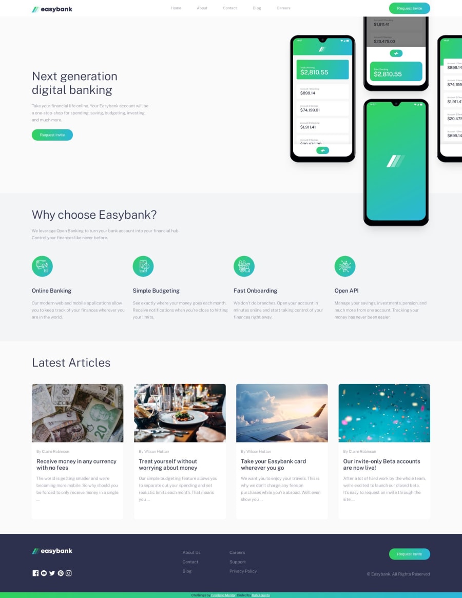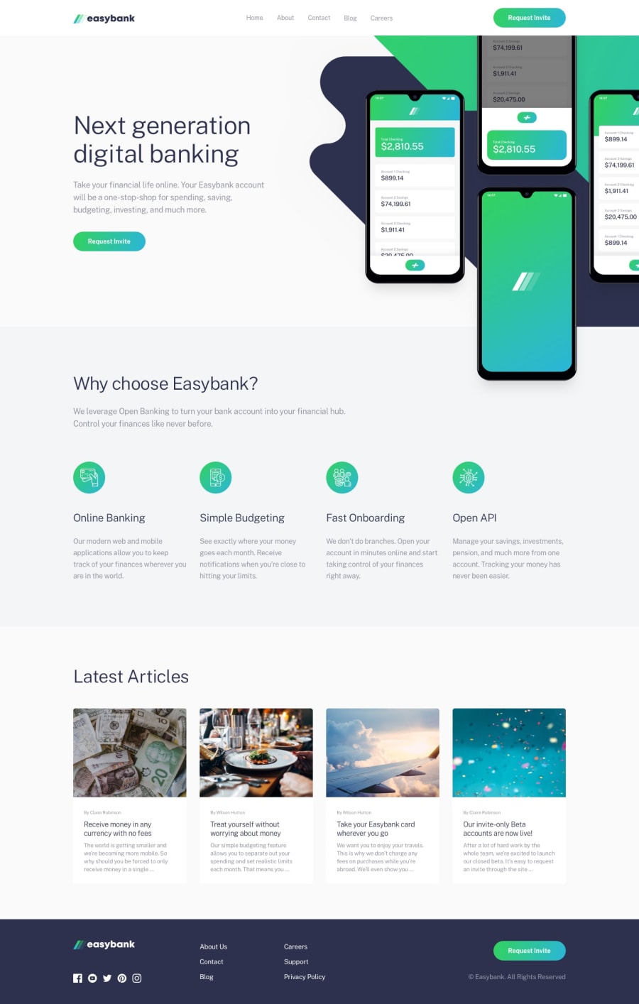
Design comparison
Solution retrospective
-
For active states of social media icons, I created 2 SVGs with different colors and switched them on hover. (a) Is there any way we can do it with CSS properties like "color" or anything? (b) Or any other better approach to it?
-
In the articles section, for some size of the screen ( > 1024px i.e. for tablet view), one of the cards would increase in size as compared to others due to content length. For solving it, I have fixed the height for content and change it for different screen sizes. Is there any better approach to it?
Community feedback
- @bashirogluPosted over 4 years ago
looks great, you can make it perfect by adding bg image in hero section. good job.
0 - @franklynwisdomPosted over 4 years ago
Hi Gupta, well done on your challenge.
Yes, you can actually change the color of an svg by using this "filter: invert(22%) sepia(96%) saturate(5090%) hue-rotate(112 deg) brightness(96%) contrast(105%);" style.
You can change the hex code of any color to the filter style by using this tool on codepen https://codepen.io/sosuke/pen/Pjoqqp
0 - @VictorSanchez25Posted over 4 years ago
Hi Rahul Gupta! Overall, the website looks like a real one, like a website of a legit company. I hope I could pull off that kind of design too! Anyway, happy coding!
0
Please log in to post a comment
Log in with GitHubJoin our Discord community
Join thousands of Frontend Mentor community members taking the challenges, sharing resources, helping each other, and chatting about all things front-end!
Join our Discord
