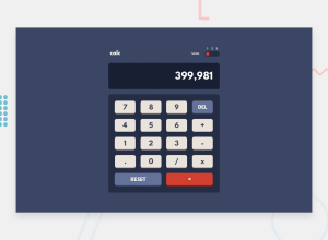
HTML, CSS's Grid & 'prefers-color-scheme' and jQuery
Design comparison
Solution retrospective
So I'm facing this problem, whenever I tap on buttons in my mobile phone, I get this light-blue coloured transparent layer on that button.
I have tried using ::selection & outline:none on the buttons, but it didn't work.
* {
    -webkit-touch-callout: none;
    -webkit-user-select: none;
    -khtml-user-select: none;
    -moz-user-select: none;
    -ms-user-select: none;
    user-select: none;
    outline: none;
}

.keys::selection {
    background: transparent;
}
If anyone can help me resolve this issue it would be great help
Community feedback
- @d4vsanchezPosted over 3 years ago
Hey Vatsal,
I found a small problem in the display, the scroll bar is always visible. You could easily remove it if the content is not overflowing by changing the
overflow-x: scrollfor anoverflow-x: auto.About the light-blue colored transparent layer, you can remove it by adding the following line to the
primary-keyclass:-webkit-tap-highlight-color: transparent;Good job on this one!
1@vatsalsinghkvPosted over 3 years agoThank you much brother, I've fixed overflow one. Dude you're amazing that transparent blue colour issue has been resolved now. This
-webkit-tap-highlight-color: transparent;worked!!!You're life-saver man! 🥺❤️
0
Please log in to post a comment
Log in with GitHubJoin our Discord community
Join thousands of Frontend Mentor community members taking the challenges, sharing resources, helping each other, and chatting about all things front-end!
Join our Discord
