Design comparison
SolutionDesign
Community feedback
- @VCaramesPosted over 1 year ago
Hey there! 👋 Here are some suggestions to help improve your code:
- Remove all the
brelements you added, they are not ❌ being used correctly.
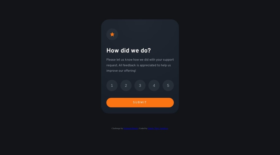
- The HTML for the ratings needs to be rewritten as it was done incorrectly ❌:
To ensure that the "rating buttons" are fully accessible 💯, they need to be built using a
form⚠️.- Everything will be wrapped inside a
fieldsetwhich will have alegendthat is visually hidden using CSS. - Inside, there should be five
input radiosand eachinputshould have alabelattached to it to make the “ratings” accessible. - The last thing you will want to include will be a
buttonso users can submit their choice.
More Info: 📚
- Once the top is implemented , for your JS, the
eventListenershould be on theformas asubmit.
More Info:📚
Click vs. Submit EventListeners
If you have any questions or need further clarification, feel free to reach out to me.
Happy Coding! 👾
Marked as helpful2@DexFAPosted over 1 year ago@vcarames thanks so much for this in-depth feedback. Wow, really means a lot. I will carefully go through it and update it as instructed. If there's anything unclear I will definitely reach out to you.
0 - Remove all the
Please log in to post a comment
Log in with GitHubJoin our Discord community
Join thousands of Frontend Mentor community members taking the challenges, sharing resources, helping each other, and chatting about all things front-end!
Join our Discord
