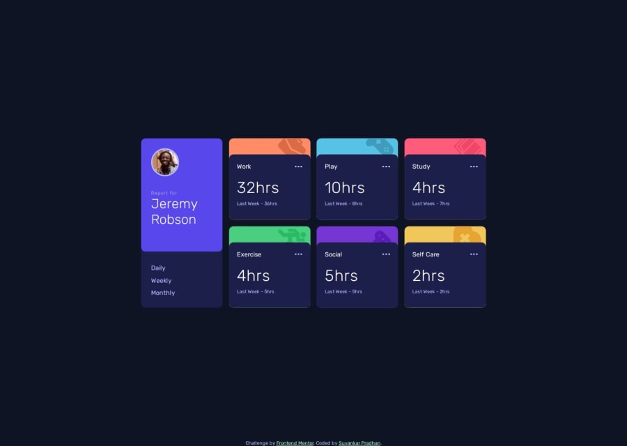
Design comparison
Community feedback
- @FlorianJourdePosted 6 months ago
Hey man,
Good job on this one !
About the bento grid, I think you should have a better layout by using this approach :
.container {
    position: absolute;
    left: 50%;
    top: 50%;
    transform: translate(-50%, -50%);
    display: grid;
    grid-template: repeat(2, minmax(0, 1fr)) / repeat(4, minmax(0, 1fr));
    gap: 20px;
    max-width: 1200px;
    margin-left: auto;
    margin-right: auto;
    width: calc(100% - 50px);
}
With this solution, you layout is already responsive-proof, you only have to alter the grid itself, not the entire layout. Avoiding relative width and height like
vw,vh&%is generally a good practice (except for specific cases).I would also recommend you to switch you grid to
flexandposition: staticplacement. Withjustify-contentandalign-itemsandmin-height: 100svh;directly on yourbody, you must be able to place you grid centered vertically without any issues 🙂Good luck for you next challenges ! ✌🏻
0
Please log in to post a comment
Log in with GitHubJoin our Discord community
Join thousands of Frontend Mentor community members taking the challenges, sharing resources, helping each other, and chatting about all things front-end!
Join our Discord
