
Submitted over 2 years ago
HTML + CSS w/ Grid + Javascript responsive page

@BernardoHollmann
Design comparison
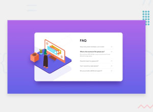
SolutionDesign

Solution retrospective
I know that there is a better solution for placing the images in the card container. It will be very helpful if someone could point out where I did wrong or share your code with me.
Community feedback
- Account deleted
Hey @BernardoHollmann, great job on this project!
Your JS code is running smoothly.
The way you placed your images is good. I wouldn't change it. If it works it works.
If you wish to reduce your HTML code, you can use the :before/ :after pseudo elements.
The only suggestion I can offer is :
- To make you content accessible to your users, it is a best to use rem/em instead of px for your CSS property values. For media queries, I definitely suggest using em for them. By using px your assuming that every users browser (mobile, tablet, laptop/desktop) is using a font size of 16px (this is the default size on browser). Em's will help with users whose default isn't 16px, which can sometimes cause the your content to overflow and negatively affect your layout.
Sources:
https://betterprogramming.pub/px-em-or-rem-examining-media-query-units-in-2021-e00cf37b91a9
Happy Coding!
0
Please log in to post a comment
Log in with GitHub
Join our Discord community
Join thousands of Frontend Mentor community members taking the challenges, sharing resources, helping each other, and chatting about all things front-end!
Join our Discord