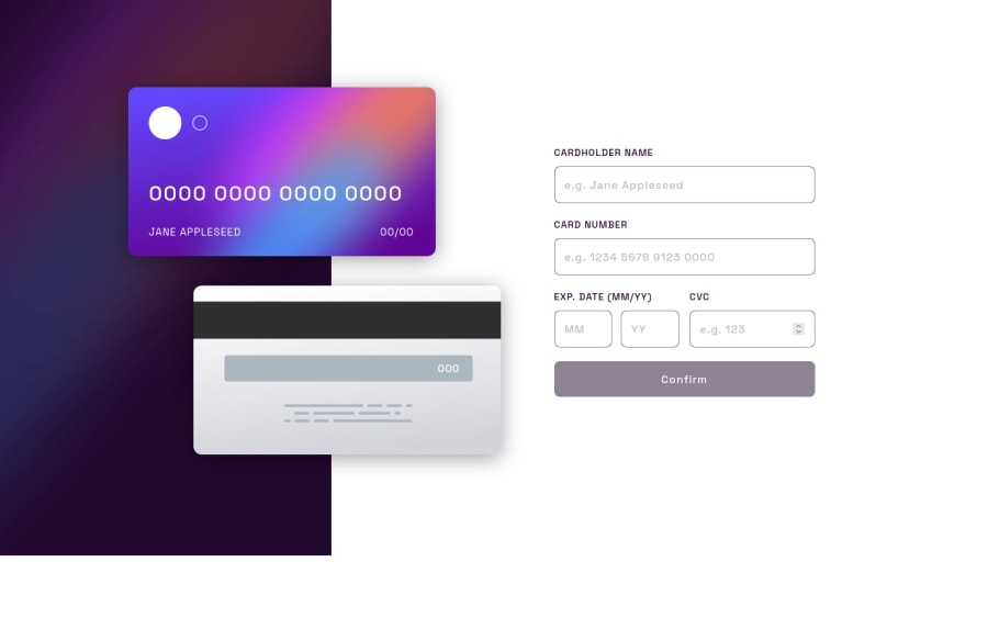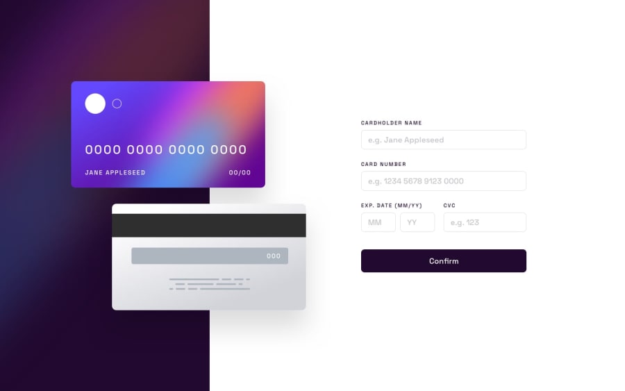
Design comparison
Solution retrospective
Any feedback reagarding the design or the javascript code will be very appreciated
Community feedback
- @Aik-202Posted about 2 years ago
Hi, Gilang Nice one!!!. The responsiveness is on point, and your design is really nice, putting a bit of box shadow on the cards was a really great idea!!. But I have some suggestions
-
If the cursor is still on any input field and the confirm button is clicked , it doesn't work. Don't know y, maybe check your JavaScript
-
Try setting the height of the image to 100vh so that it takes the total height of the viewpoint.
-
You can use
max-lengthattributes in your html to ensure that the user only enters 3 CVC numbers, 19 card numbers, 2 numbers for the month and year as well... -
I also noticed that there's no validation taking place for the card name field, the users are allowed to enter just anything. That is For the card name, only letters should be allowed and vice versa.
-
For the month field the user should only be allowed to enter numbers 1 to 12 as there are only 12 months, you can do a check for that.
-
The error Message for the Year field is overlapping that for the Month, try positioning them well.
7.) It will also be nice if when the user clicks confirm and there's any input field left blank, an error message will tell them that...
Hope this helps....
1@madegilangadityaPosted about 2 years ago@Aik-202 Hi, thanks for your suggestion, will try to fix it at the moment
0 -
Please log in to post a comment
Log in with GitHubJoin our Discord community
Join thousands of Frontend Mentor community members taking the challenges, sharing resources, helping each other, and chatting about all things front-end!
Join our Discord
