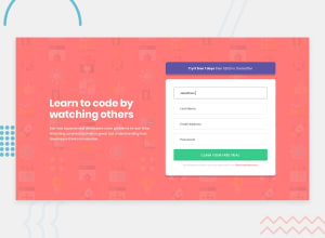
Design comparison
Solution retrospective
As always any feedback is more than welcome. Thanks
- Cross browser compatibility is improved.
Community feedback
- @aemann2Posted over 3 years ago
I'm not sure how long you've been coding for, but it's smart that you're using
min-widthmedia queries. I've been coding for around 9 months and I only just started doing that in the past few months. It's made styling so much easier to do the mobile styling first, then scale up to the desktop.0@philjacksPosted over 3 years ago@aemann2 thanks mate! I had a nightmare with my previous responsive project so thought I'd give 'mobile first' a go. Defo gunna do it like this from now on! Been coding 5 months & become obsessed haha
1 - @palgrammingPosted over 3 years ago
But Firefox currently does the same thing the screenshot is showing And Chrome seems to look like you wanted it too
Interesting kind of like how I found Chrome does not like... Justify-content left or right but wants flex-start or flex-end it seems that Chrome can Justify content space between with no set height on the element. so you have Margin 0 being inherited on your inputs and have the form set space evenly but seems that Firefox will not do it without a height on the container so it knows how much space it has. So you can either add margin to your inputs or give the container a fixed height and I think things will will work then in both browsers.
maybe someone smarter than me can jump in and help us out with better information
0@philjacksPosted over 3 years ago@palgramming Aah! Thanks for pinpointing the problem. I'm gunna start checking cross browser compatibility properly going forward. I'll research more into that
0
Please log in to post a comment
Log in with GitHubJoin our Discord community
Join thousands of Frontend Mentor community members taking the challenges, sharing resources, helping each other, and chatting about all things front-end!
Join our Discord
