Design comparison
Solution retrospective
Any feedback is welcome
Community feedback
- @tesla-ambassadorPosted about 3 years ago
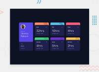
Hey, this is a really great solution, It's really impressive! The thing you need to work on the most is just the responsiveness, it's only responsive after reaching a certain screen size which is below that of a standard phone. I normally tackle that problem by continuously adjusting my screen size and applying appropriate media queries when things start losing an organized alignment, I usually use 3 - 4 media queries. Try it out! I think it could work for you too! For the accessibility issue, just add an h1 tag because websites usually require that and it's good html code practice. Otherwise, this is a really awesome solution, I like it! Kudos! Keep on coding😎
1@DziugisLTPosted about 3 years ago@tesla-ambassador Yeah, when I work on big and important projects I do add several media queries so that every screen size would look good. This one was to practice a little JS on how to populate the site from the data.json file. Thank you though!
0@tesla-ambassadorPosted about 3 years ago@DziugisLT You're welcome and very cool!😎
0
Please log in to post a comment
Log in with GitHubJoin our Discord community
Join thousands of Frontend Mentor community members taking the challenges, sharing resources, helping each other, and chatting about all things front-end!
Join our Discord

