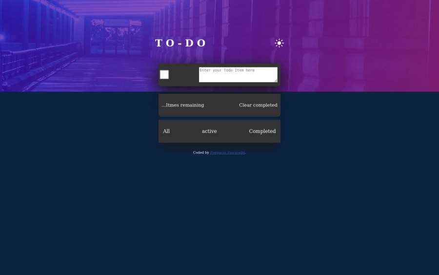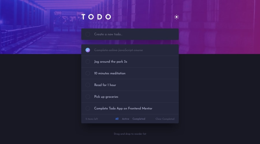
Design comparison
Solution retrospective
This is a first project I completed outside of watching a tutorial, I did it all with my own thought process and used what I believed to be the right solution.
I'm aware that my choices are most likely not considered 'best practice' so I would love some feedback on what I can improve and better ways to have solved the problems more efficiently. Thanks !
Community feedback
- Account deleted
Hi, First thing I noticed is that it looks nothing like the design, I guess you cam make it however you want.
-
It works as a to-do app but the functionality could use some getting looked at, instead of clicking the checkbox next to the input I should be able to hit enter.
-
The sun/moon icon get lost when you switch themes and gives the
alttag, you should get your paths looked at.
0 -
- @afrusselPosted over 3 years ago
Hi, as a first attempt it's good. There are couple of things you need to change.
- input field not looking good
- getting confused the checkbox and how to add list
0
Please log in to post a comment
Log in with GitHubJoin our Discord community
Join thousands of Frontend Mentor community members taking the challenges, sharing resources, helping each other, and chatting about all things front-end!
Join our Discord
