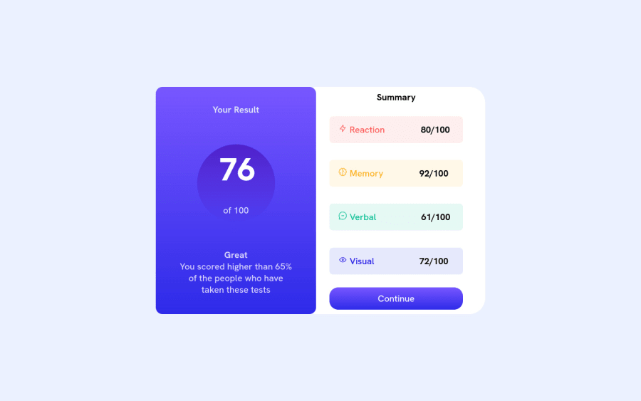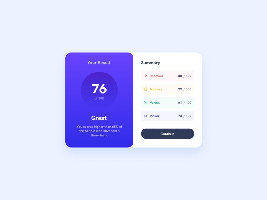
Design comparison
SolutionDesign
Solution retrospective
It was tricky, but all done
Community feedback
- @NeverSeenLifePosted about 2 years ago
You can centre the percentage of the result more easily by using only display:flex
// Dont use inline-grid in here
.circle {
	display: inline-grid;
	place-items: center;
}
// And don't use position in here too
.circle76 {
	position: relative;
	top: 35%;
	left: 25%;
	transform: translate(-50%, -50%);
}

// You can do everything with just a flex
.circle {
	background: linear-gradient(hsla(256, 72%, 46%, 1), hsla(241, 72%, 46%, 0));
	width: 175px;
	height: 175px;
	border-radius: 50%;
        display: flex;
	flex-direction: column;
	justify-content: center;
	align-items: center;
}
Marked as helpful1@KudzuyaPosted about 2 years ago@NeverSeenLife Thank you mate. Appreciate the help. I'll change it in the evening)
0
Please log in to post a comment
Log in with GitHubJoin our Discord community
Join thousands of Frontend Mentor community members taking the challenges, sharing resources, helping each other, and chatting about all things front-end!
Join our Discord
