Submitted over 3 years ago
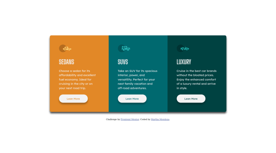
3-column preview card component using html, css, using flebox
@Mtc-21
Design comparison
SolutionDesign
Solution retrospective
Any suggestions on how I can improve are welcome!
Community feedback
- @CyrusKabirPosted over 3 years ago
hello my dear friend ♥ you did good and clean at all but here some advices :
- don't add height for containers . let content give that and it's dynamic way it's better
- at first of developing you should have a great and good look to design and analyze every part of it so you can find out in this case buttons have some space from top or from text
- you have some jumping in hover state for buttons it's for border. added at default it's not problem
- also it's better to use " css resets " not just add an universal selector ( * i mean ) and remove broswers style
Marked as helpful0@Mtc-21Posted over 3 years ago@CyrusKabir great, thanks for your observations, I will apply the modifications with your observations to see how it goes.
0
Please log in to post a comment
Log in with GitHubJoin our Discord community
Join thousands of Frontend Mentor community members taking the challenges, sharing resources, helping each other, and chatting about all things front-end!
Join our Discord
